by jkimble | Feb 8, 2017 | Original Pastel Fine Art for Sale
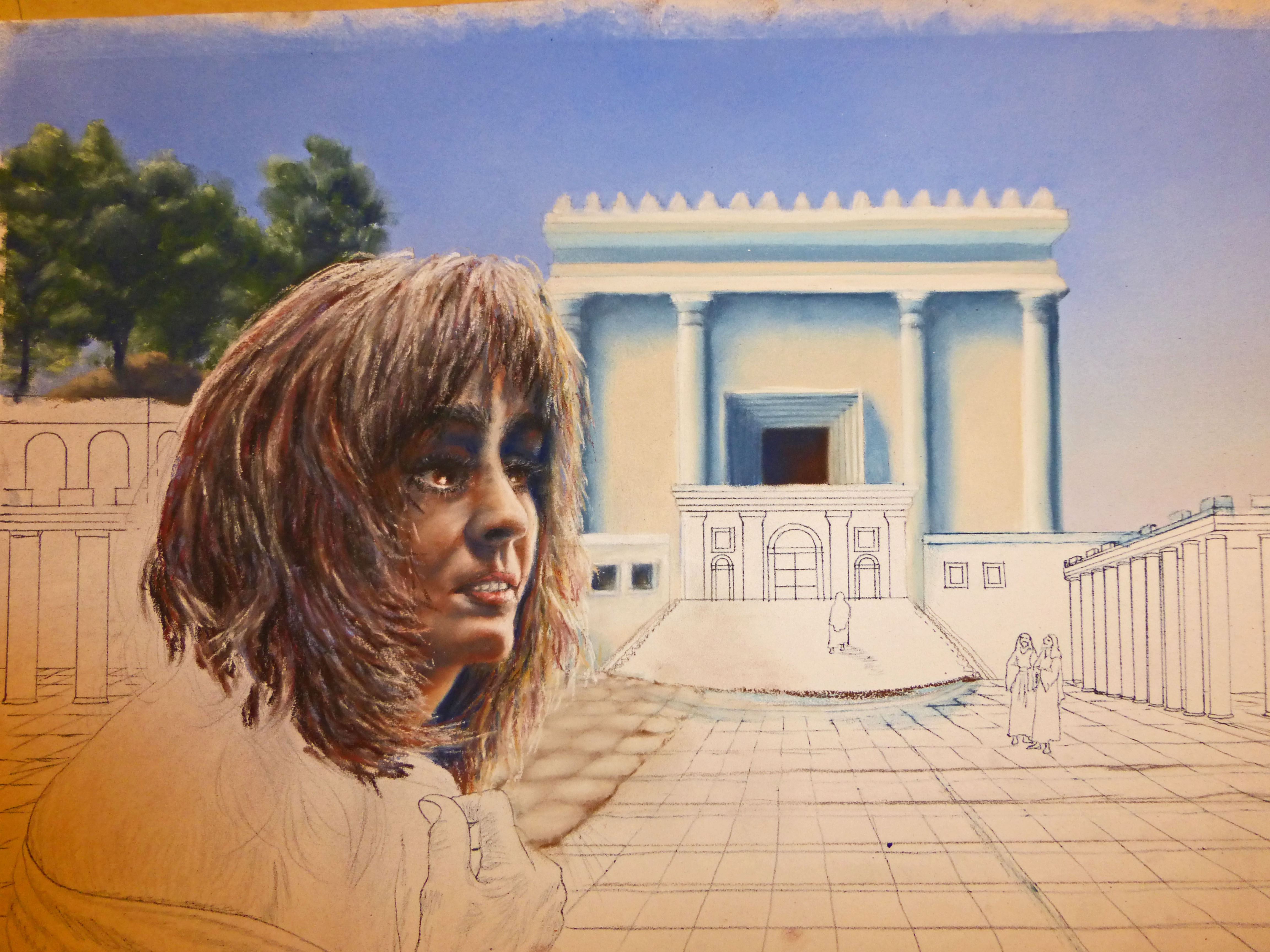
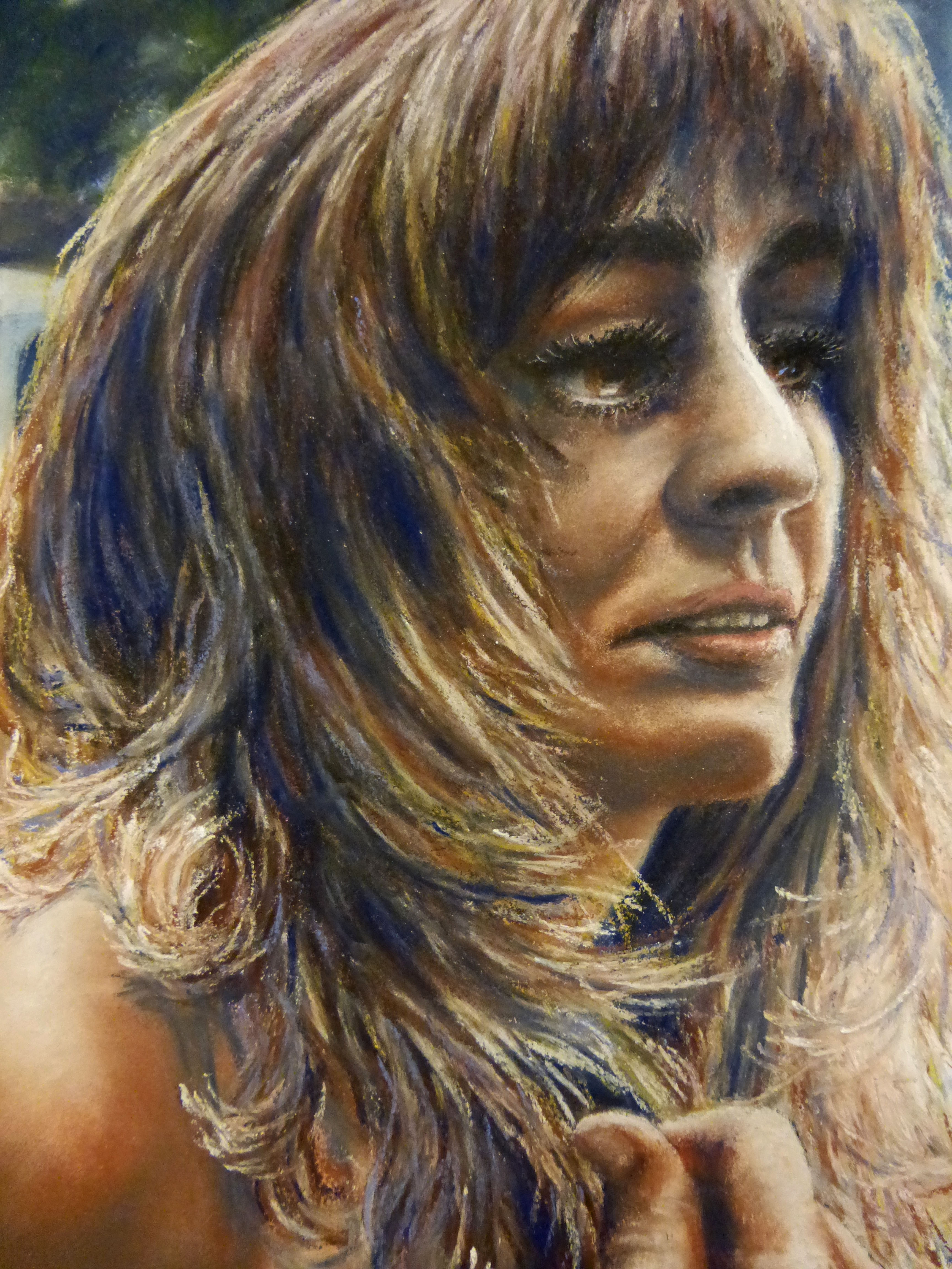
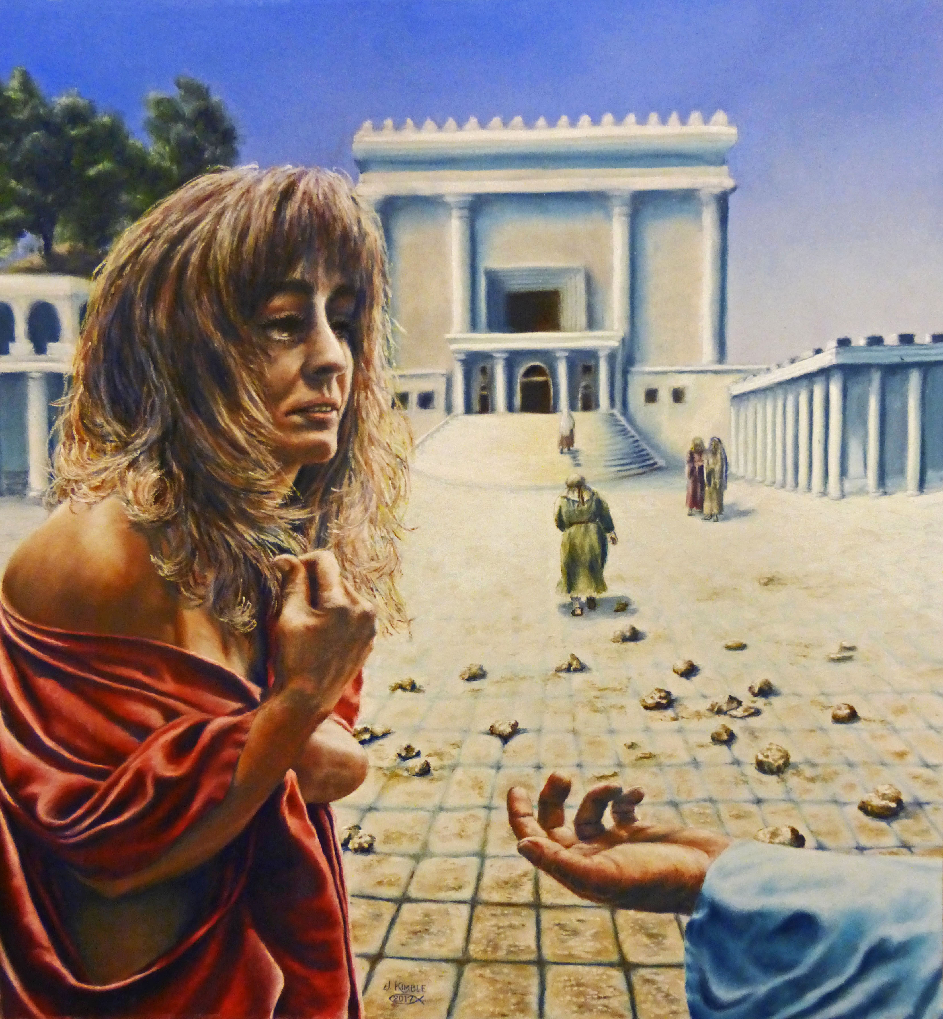
Last week I completed # eleven in my twelve-part series of paintings of “WOMEN”S STUDIES–Defining Moments.” I started this project in the fall of 2014, and I will finish it in the spring of 2017. Two and a half years! I’m not sure I’ve ever been so dedicated to any single art project before. It has been a journey, a learning experience not just about the women and their times, but also about me, how they spoke to me down through the millennia about issues I grapple with today. There were times I never thought I’d make it this far; times I never believed I could make it this far, and yet, I have. I remember wanting to throw out certain paintings when I hit road blocks I couldn’t get over, but somehow, I found the fortitude to move around instead of over those road blocks, and move forward. Two and a half years… Who’d have thunk!
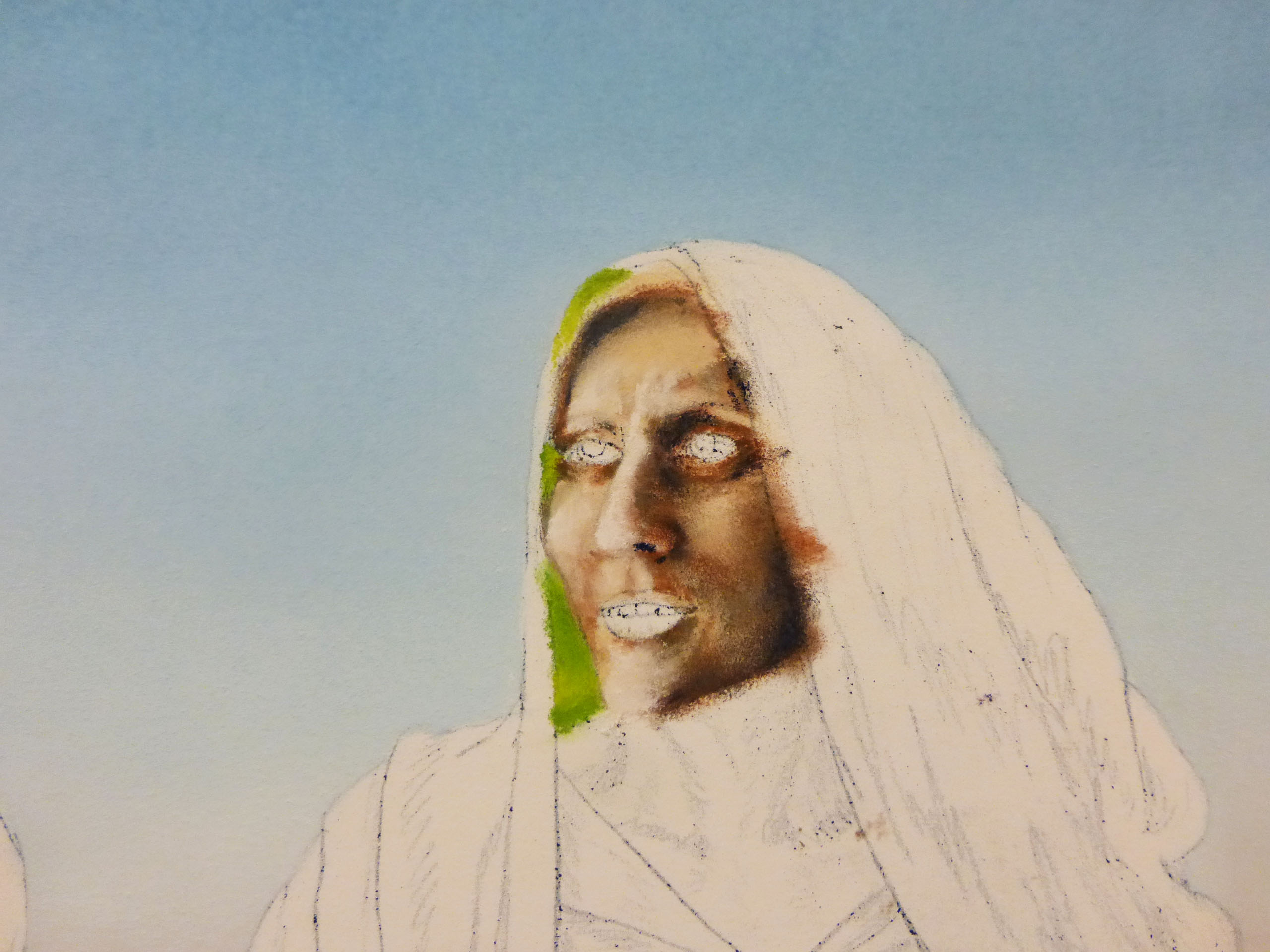
Last week I finished up “The Woman Caught In Adultery”. Tonight I started her accompanying scripture calligraphy, and will finish that tomorrow. Then, I will be moving on to # twelve, “Pharaoh’s Daughter.” What’s next? What happens after this? Where do I go from here?
In a way, I will be sad to see this project come to an end, especially when I remember how I thought I’d never finish! It has been a driving force, a goal I knew in my heart that I must complete. But, already I am thinking about another book with art and poetry and painting tips, etc. Already I have some other paintings on my to-do list, some secular and some biblical. Already I wonder if I can get it all done! Can’t wait for God to show me exactly where He wants me to go with this next phase! Past experience has proven to me that He will show me the way. I have no reservations or feelings of being in the dark about what lies ahead, because He is the Way, the Truth, and the Light, and I walk in His light while He shows me the way; and I abide in His truth. Man, what a way to go!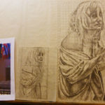

by jkimble | Dec 6, 2016 | Original Pastel Fine Art for Sale
WHAT ABOUT THAT GLASS?
Last Wednesday, My Man Jim and I journeyed to my hometown of Kilmarnock, VA, to see my framer of 35 years. I was taking to her the newly completed and unframed paintings of “Ruth”, and “The Woman With An Issue Of Blood”. I would also be picking up three newly framed pieces: “Sarah”, “Mary, Mother Of Jesus”, and “The Woman Who Anointed Jesus”. Wow, they surely did look nice, and I knew the ones I just took in would look just as good when I pick them up in the future. The framing is great; the suede mats and filet bring out the colors perfectly, and…there is no glare on the glass, which makes it look as if there is NO glass at all over those pastel paintings! So what’s up with the glass? It seems like something relatively insignificant in comparison to the molding and matting. Glass is glass, right? It’s just a clear covering to protect the art, isn’t it? Well, yes, but did you know there are all sorts of glass you can put into a frame, and that some are far better than others for protection?
So, here’s a little tutorial on glass. Most people select clear, smooth picture framing glass because it has some obvious advantages. It is made perfectly smooth, with no warps or air bubbles to distract the eye or distort the image underneath. You may have noticed that it has a very slight greenish hue, but most people don’t think it affects the work underneath, if they notice it at all. It’s only noticeable if you compare the art with glass over it, and then take it away. You’ll see it is just not quite as bright with the glass over it. It is, however, an inexpensive way to protect the art from dust, dirt, and moisture, and most framers have it on hand in abundance. Its drawbacks are several. It is highly reflective. This can be a disadvantage if you must hang a work under glass in a room with many windows, or strong lighting. Because it acts like a mirror, you may be seeing more of the reflections from the room than the image under the glass! .Also, UV light can penetrate through the glass and will fade whatever is underneath it in relatively short order. It is the main reason lithograph art prints go “blue” over time. Fabrics and other materials can also fade, not to mention the matting. UV light comes from several sources, principal of which is sunlight pouring through windows. Never hang a prized piece of art where it will be subjected to direct sunlight, Even sunlight which is reflected around a room off of mirrors or light colored walls can fade a piece of art. Many people don’t realize that UV light is also emitted from fluorescent light bulbs and fixtures. This was never a problem when most household light bulbs were incandescent, but with the energy saving bulbs today, your art is bombarded almost constantly with UV light. This glass will not protect your art from fading. So you may turn to non-reflective glass to solve some of these problems. Unfortunately, that doesn’t work either. Non-glare glass is NOT non-glaring! I’m not sure why it’s called that! Non-glare glass is smooth on one side, and slightly ‘pebbled’ on the other side. The pebbled texture is extremely fine, producing a “satin” finish that, when placed over an image, does not create the mirror reflections of regular glass. Instead, it produces a uniform glare from the light shining on it. You still can’t see the image if strong lighting is hitting it. It’s a little better, but not much. It also is inexpensive. An annoying drawback to this glass is that if it is raised just a bit from the surface of the image, it will soften crisp lines and sharp details. It’s not too noticeable with a double mat, but beyond that, it can make your image look fuzzy because of its finely frosted surface. You certainly could not use it in a shadow-box framing situation! Alas, it does not provide UV protection, either. Your third option is to use conservation glass, which usually has to be ordered. It is considerably more expensive, so most framers do not carry it in stock. It will protect your artwork from 95% of the UV rays, but it is still reflective, like regular picture framing glass. If you have a spot to hang art that is not facing windows or bright lighting that would reflect strongly, I would recommend it. But what’s a person to do when the art has to be hung in a room with nearly all glass along the opposite wall, and ceiling lighting that is all fluorescent, along with table lamps, etc.? Here is what I now use exclusively on my original art: museum-grade conservation glass. This glass has a greenish, bluish coating on one side which cancels out the greenish hue from the glass itself. An example of how that works would be to look at the color yellow through a yellow film, and you won’t see yellow because it’s filtered out! This coating is very hard to clean, so it is placed on the inside of the frame, facing the image. The coating is also almost completely non-reflective, so you don’t have to worry so much about window glare or light bulb reflections. This glass was made to protect priceless museum art works from UV damage from lighting, and also to render the piece reflection-less for the viewing pleasure of the public. The glass itself is still UV protective up to at least 95%. Best of all, you cannot tell it’s even there! It is truly amazing how much brighter and more vibrant art looks under this glass! Once it is properly framed by a professional framer, with proper care and handling, you should never need to have your art re-framed again. But, be prepared to pay a price. This glass is expensive compared to ordinary picture framing glass, and it, too, will have to be specially ordered. If you have a dearly loved piece of art that you truly care about or that was costly, I highly recommend this glass. It is worth the price to preserve something of such great value, whether sentimental, monetary, or both!
by jkimble | Dec 5, 2016 | Original Pastel Fine Art for Sale
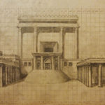
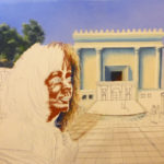
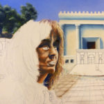
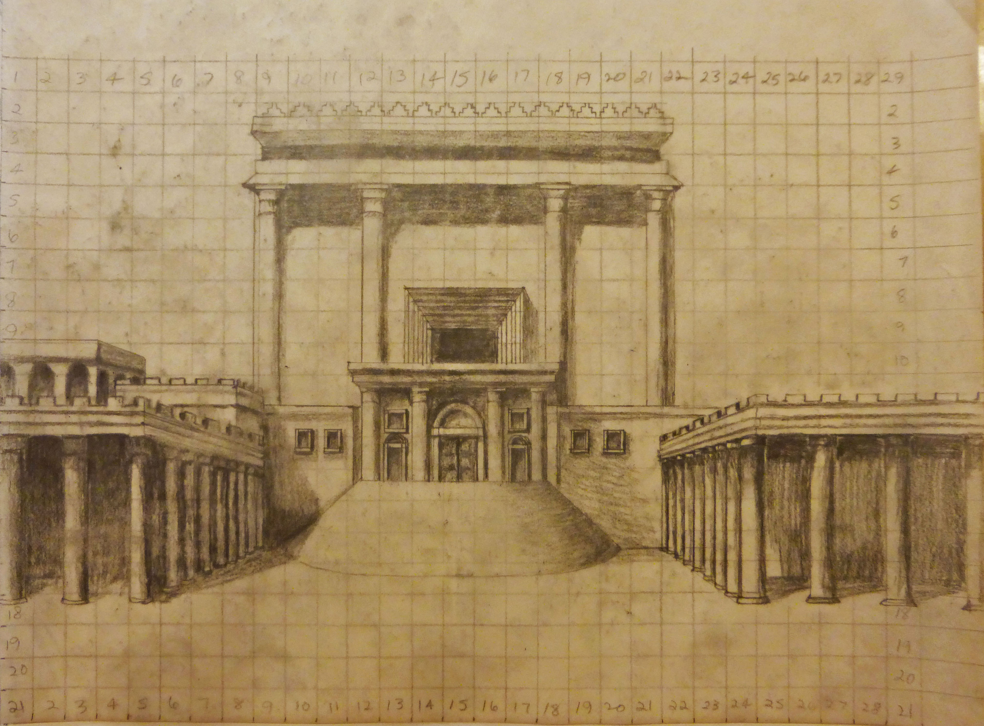
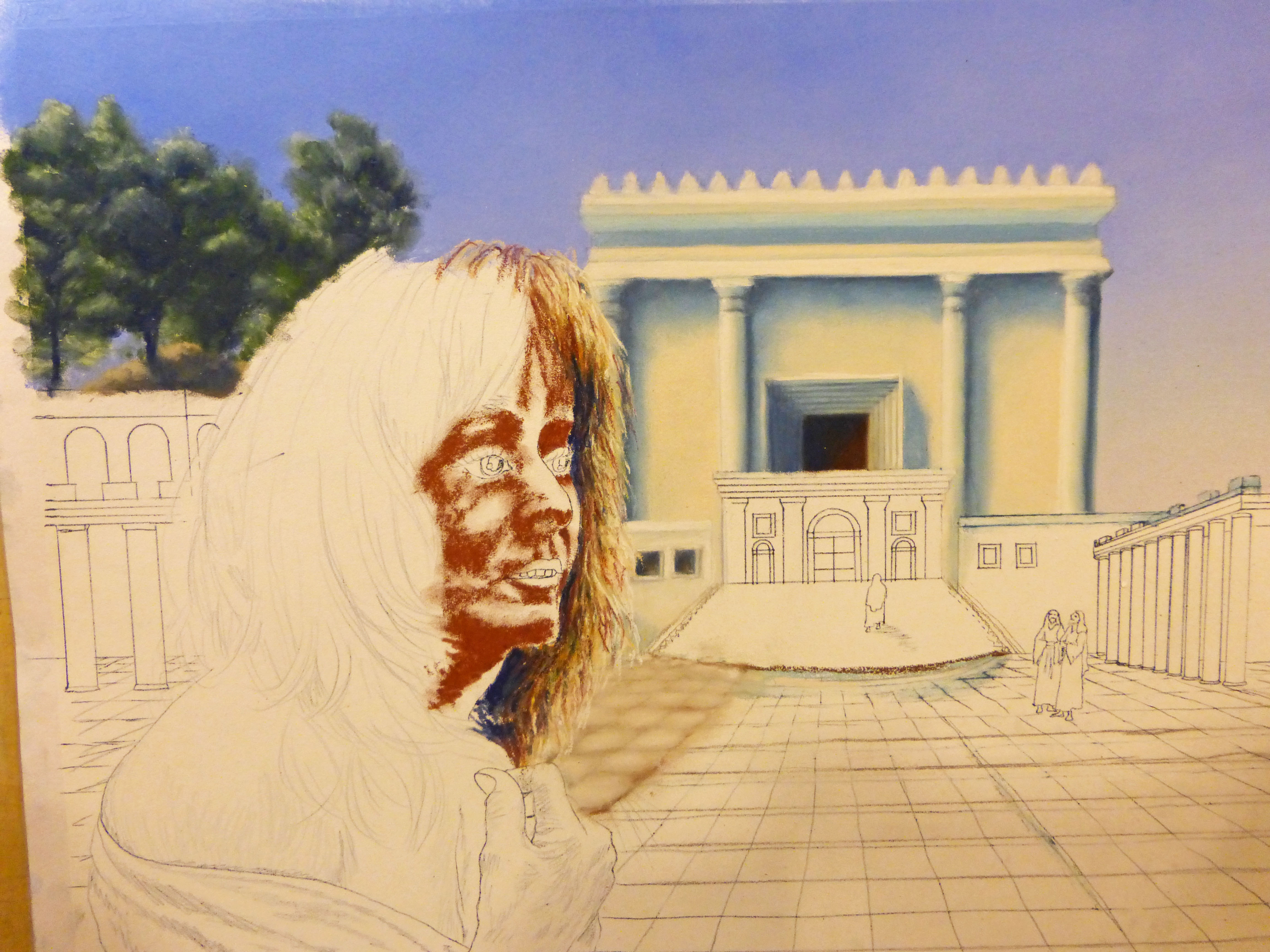
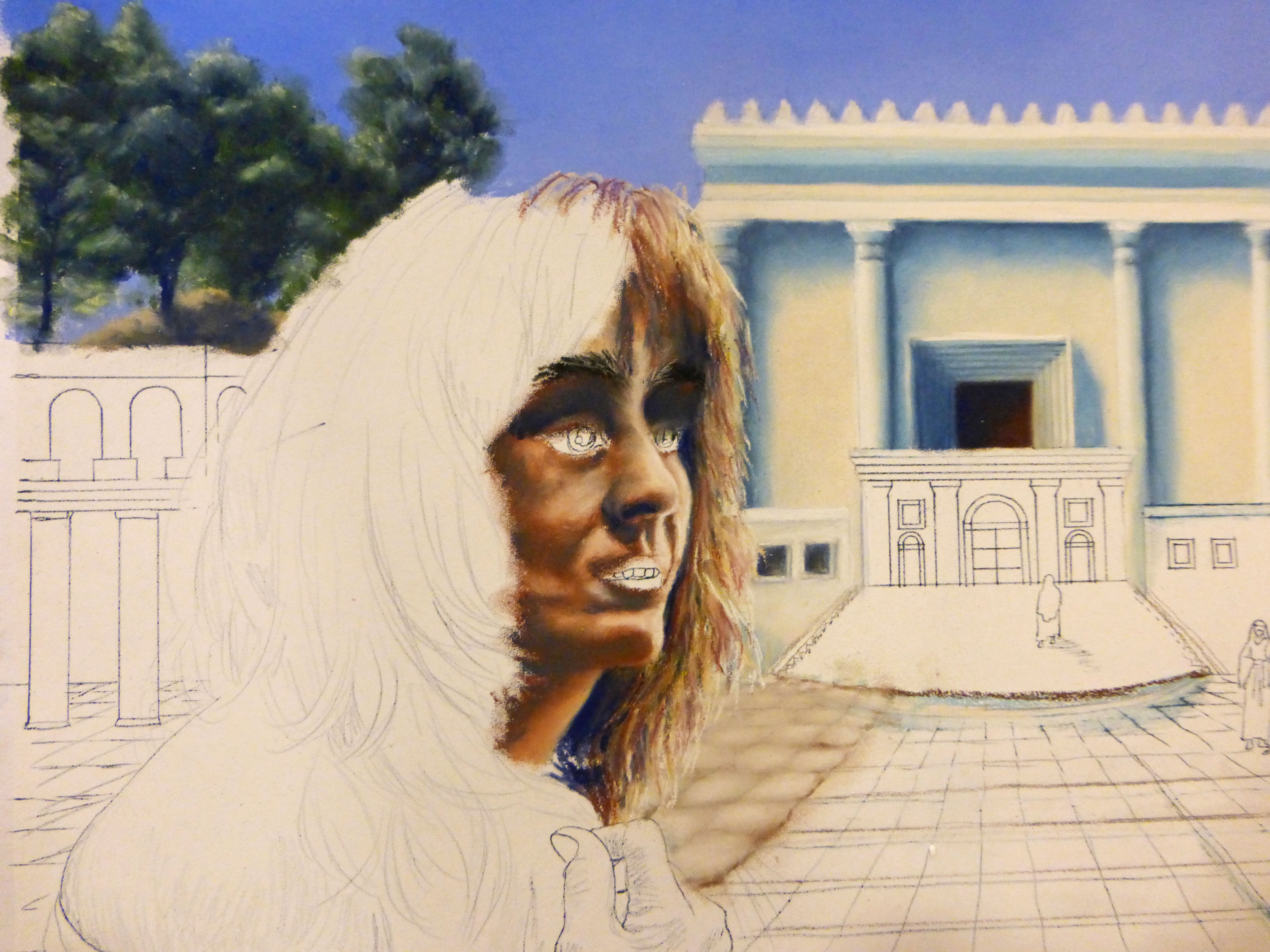
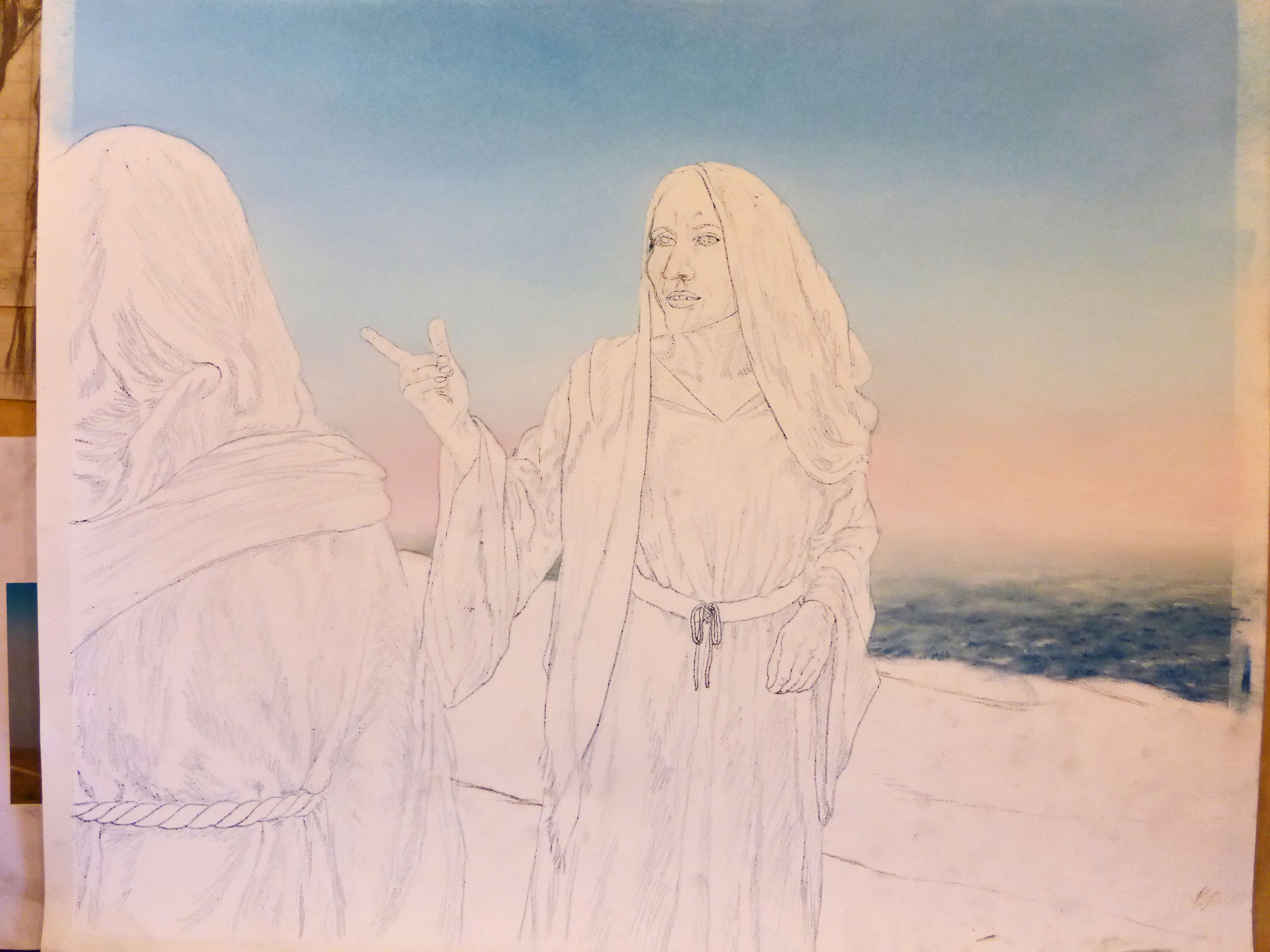
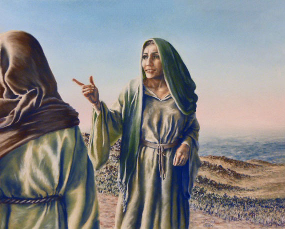
The Progression Of “Ruth”
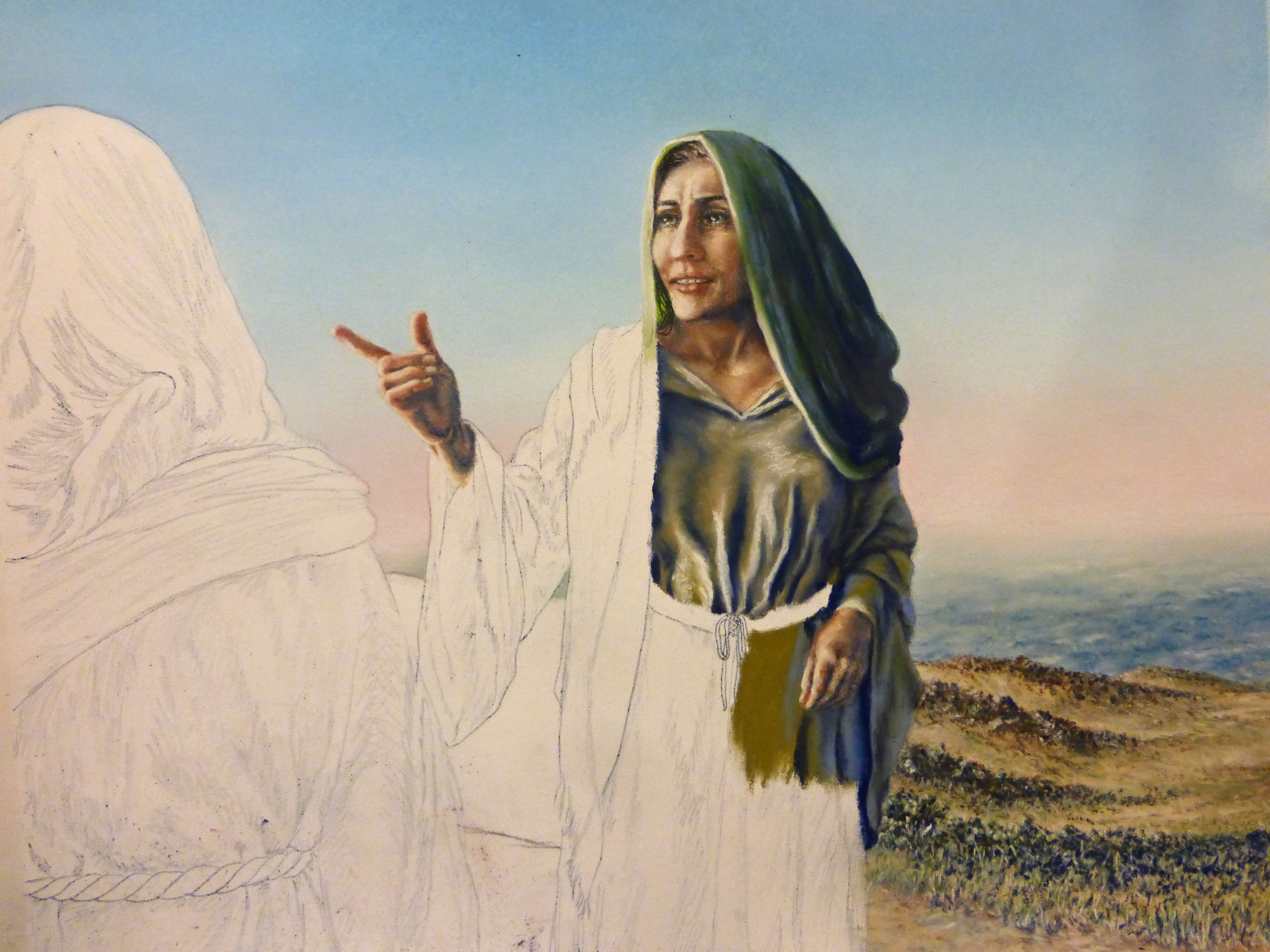
Ruth is number ten in my series of “Women’s Studies” paintings. My daughter, Alexa Carlo-Hickman, was my model for Ruth, so this was especially personal! I really wanted it to look like her, and it does resemble her, but, like the rest, it is not an exact portrait. I had to change her nose, eyes and eyebrows. I did a lot of research for the background of this painting, as I had done for “The Shunammite Woman”. There is a mountain range all around the eastern and southern edges of the Dead Sea, with a heavily traveled trading route on a ridge all along the range. This is the setting for Ruth’s declaration of loyalty to Naomi. I had a pretty good time painting Ruth, especially while I was thinking, “Only t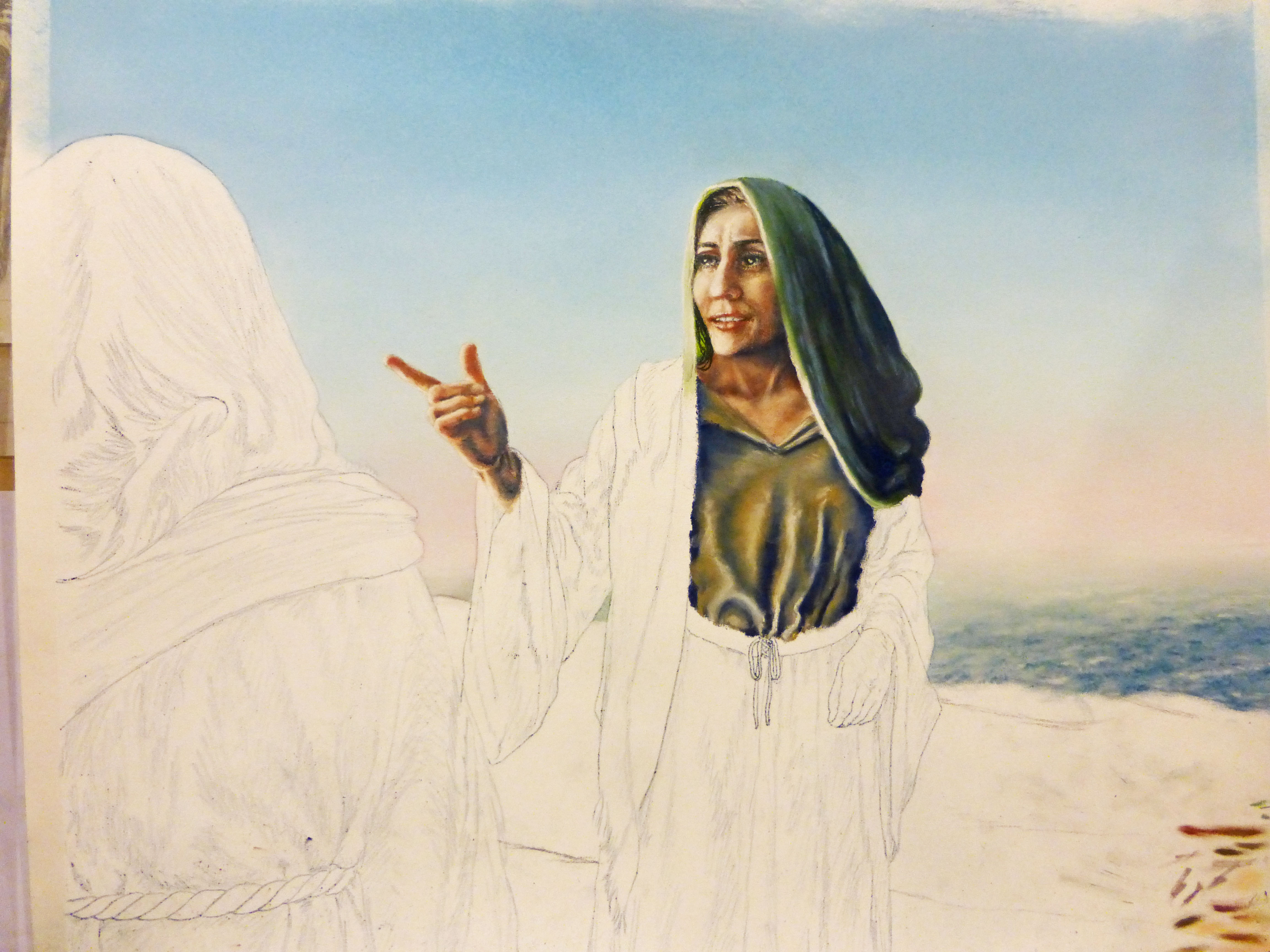 wo left to go…”


by jkimble | Oct 26, 2016 | Original Pastel Fine Art for Sale
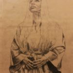
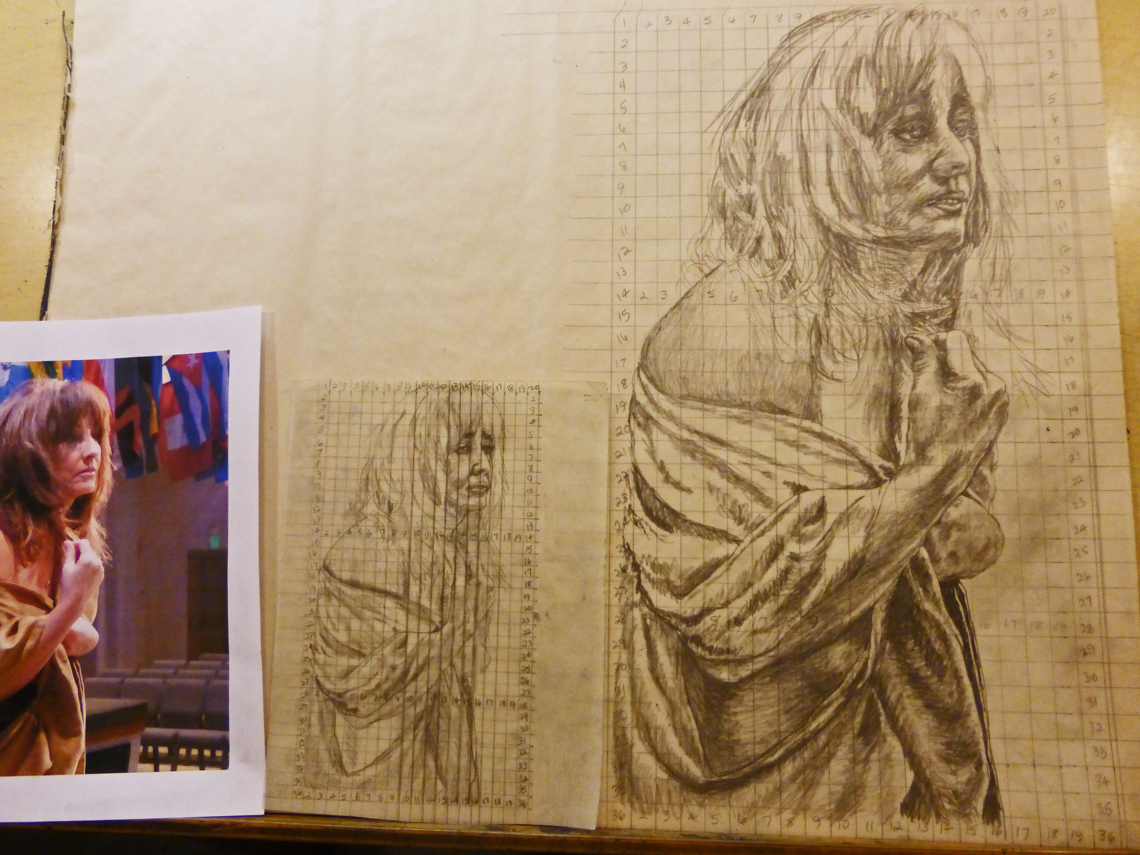
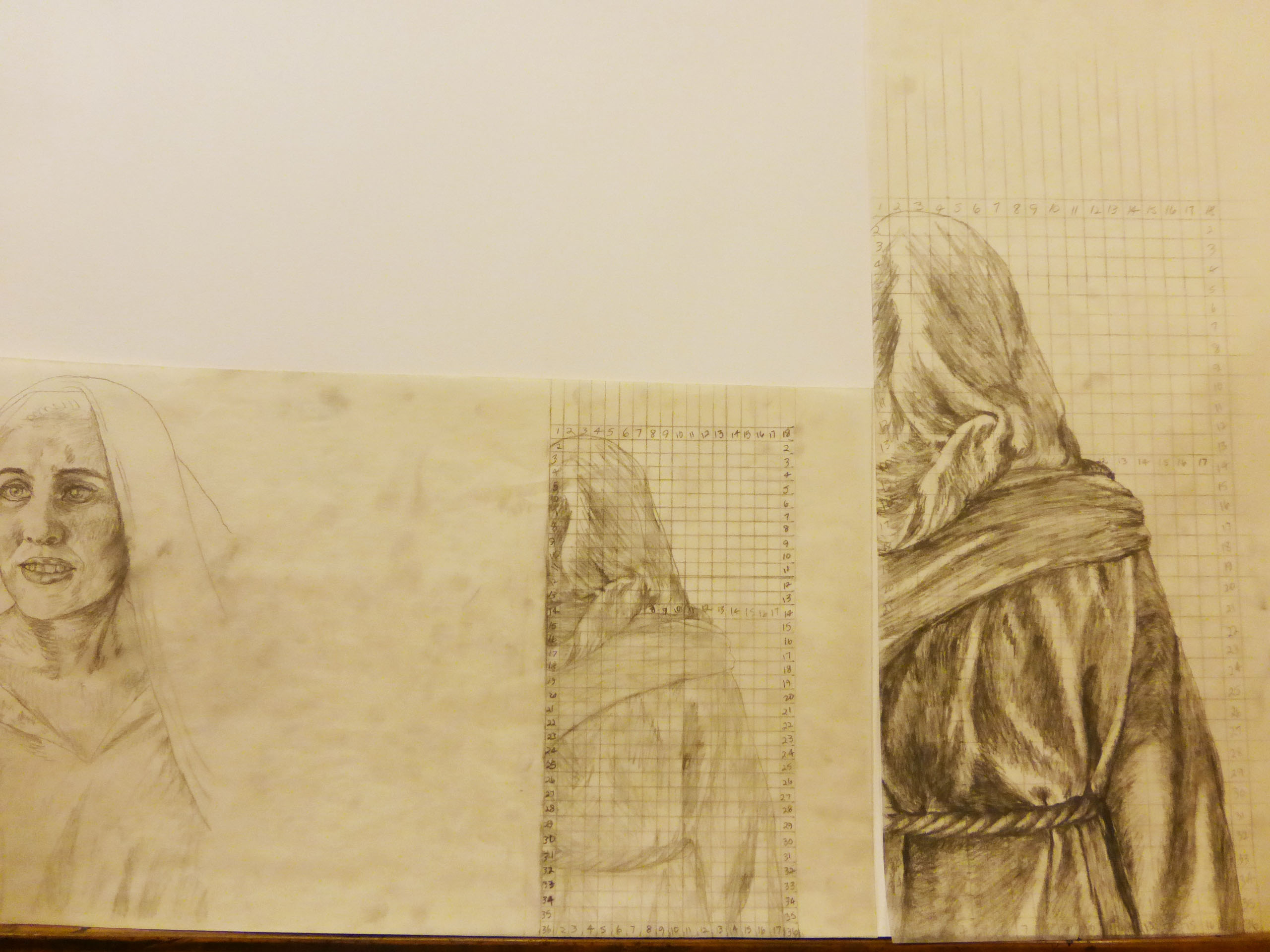
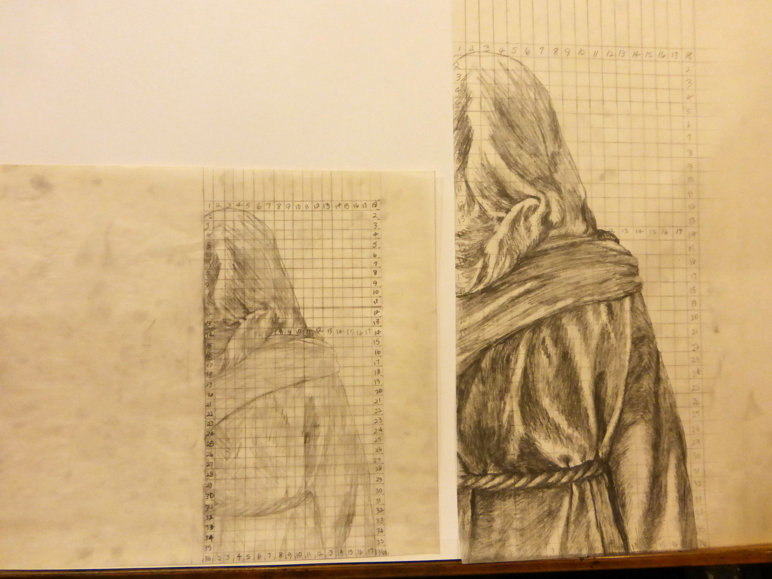
“RUTH” PATTERNS STARTED! CARTOONING TECHNIQUE
Here is an interesting little art history lesson on pattern making. It’s a technique that is truly time tested!
Tonight I started on the pattern(s) for “Ruth”. I use the plural because Naomi’s back, and the frontal view of Ruth will be in different sizes, and I have to make them separately in order to achieve the proper perspective in accordance with their proximity to each other. This requires two different grid sizes. OK, so here’s what happens in this process: I draw out my pattern, then mark it off in a grid, usually 1/4 inch. If I’m going to enlarge it, I draw out another grid, let’s say 5/8 inch. Then I number off both grids. I look at the lines in block 1 on the smaller grid pattern, then start drawing those lines in block 1 on the larger grid pattern, following the lines block by block until the pattern in completed. After the outlines are completed, I usually fill in the basic shading and correct as many mistakes as I can see on the completed larger pattern before transferring to the final art paper. The purpose of all this is to make my mistakes here, so they don’t get transferred to the art paper
.
This technique has worked for centuries. Michelangelo learned the process while he was an apprentice under Leonardo DaVinci. It was called “cartooning” back then, and was used for putting patterns on wet plaster for fresco painting. By the time Michelangelo was on his own and painting the Sistine Chapel ceiling, he had an army of apprentices working for him, too. He would draw out the patterns. His apprentices would grid them out according to the size of the area of the ceiling he was working on for a particular scene, and blow them up on a huge grid to fit that area. Then, they would punch tiny holes along the lines, much like a punch wheel is used today on pattern transfers in sewing (for you seamstresses out there, or sign painters who use a punch wheel for lettering patterns). After that, Michelangelo would apply wet plaster in whatever area he was frescoing, place the pattern over it, and dab the holes with a bag of powdered cobalt chalk. The chalk would sift through the cloth of the bag, through the holes in the pattern, and onto the wet plaster. When the pattern was removed,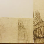
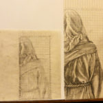 it was outlined in blue chalk powder on the wet plaster, just waiting for Michelangelo to fill in the details with paint. Voila! Frescoes!
I do exactly the same thing except I’m not using wet plaster or blowing up the images so huge. I figure if it worked well enough for Michelangelo, it surely is good enough for me!
by jkimble | Oct 14, 2016 | Original Pastel Fine Art for Sale
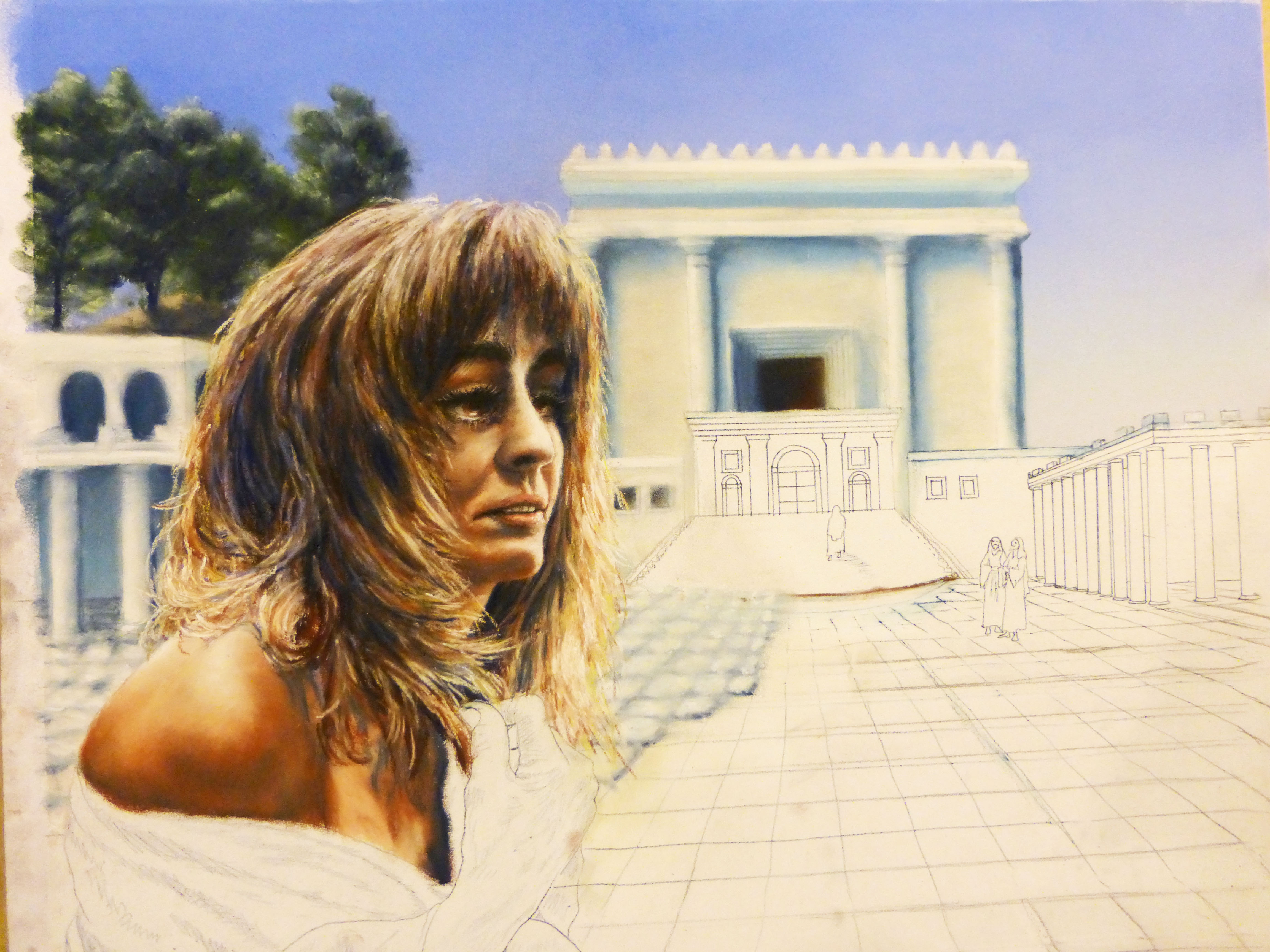
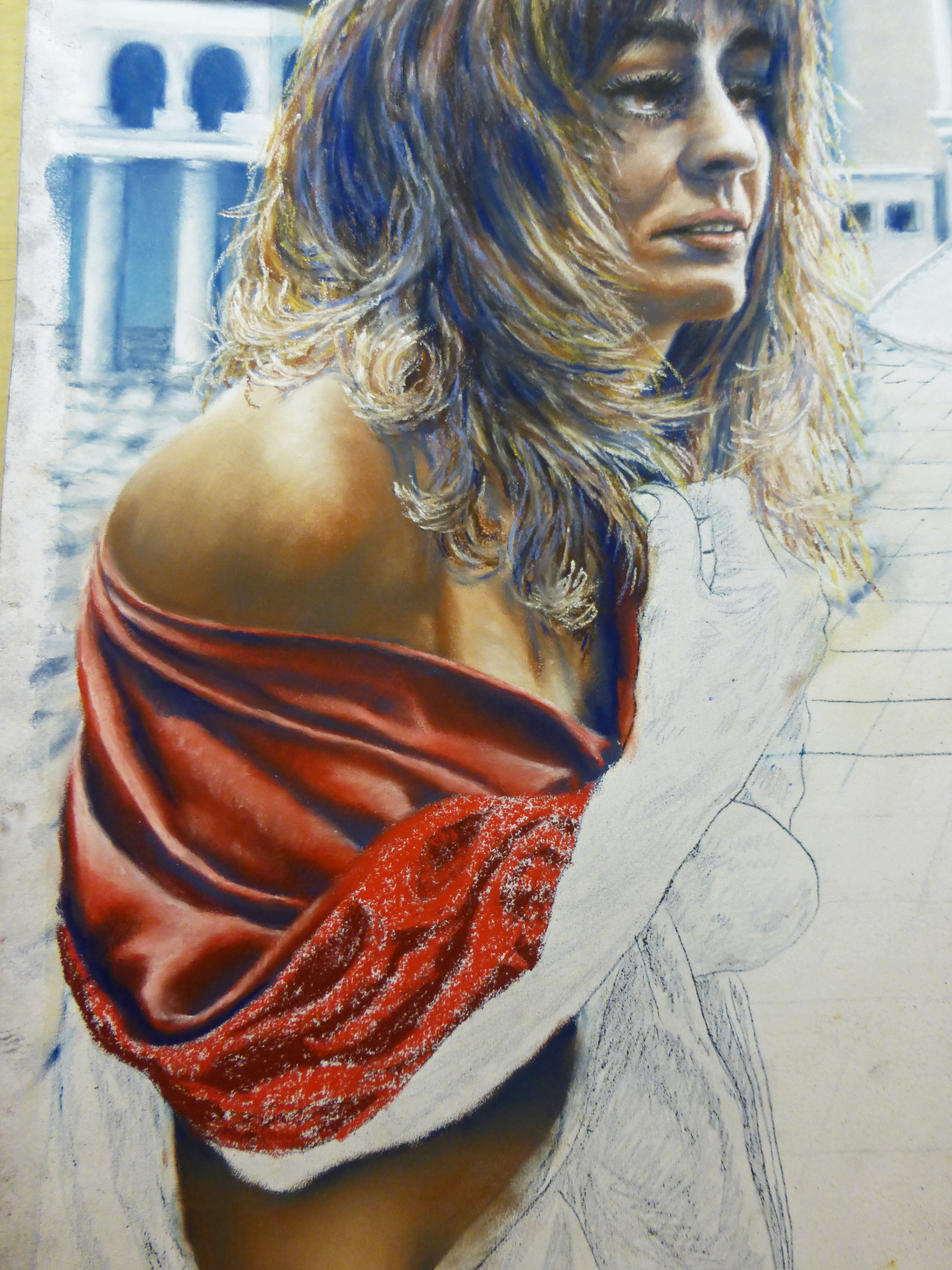
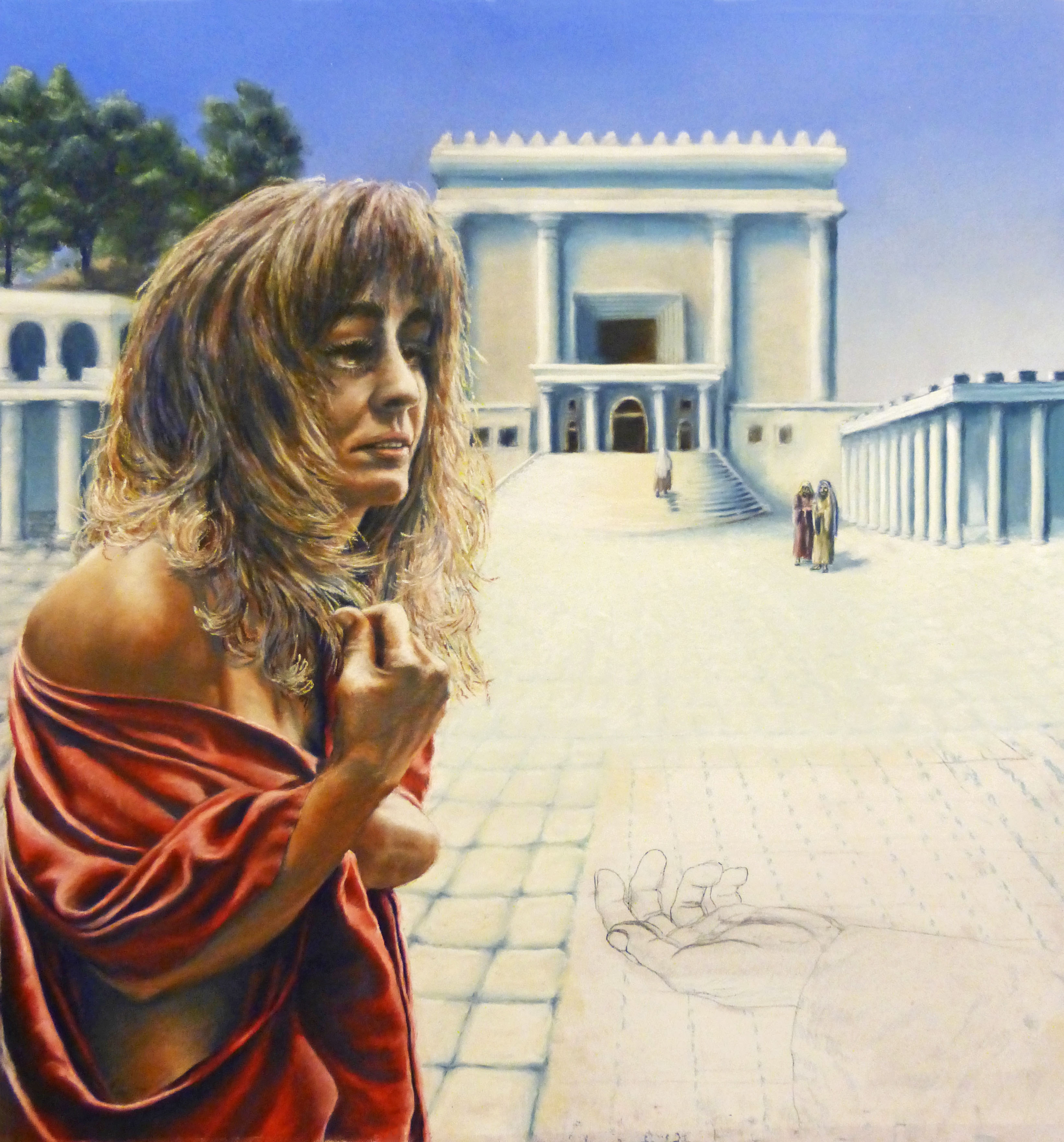
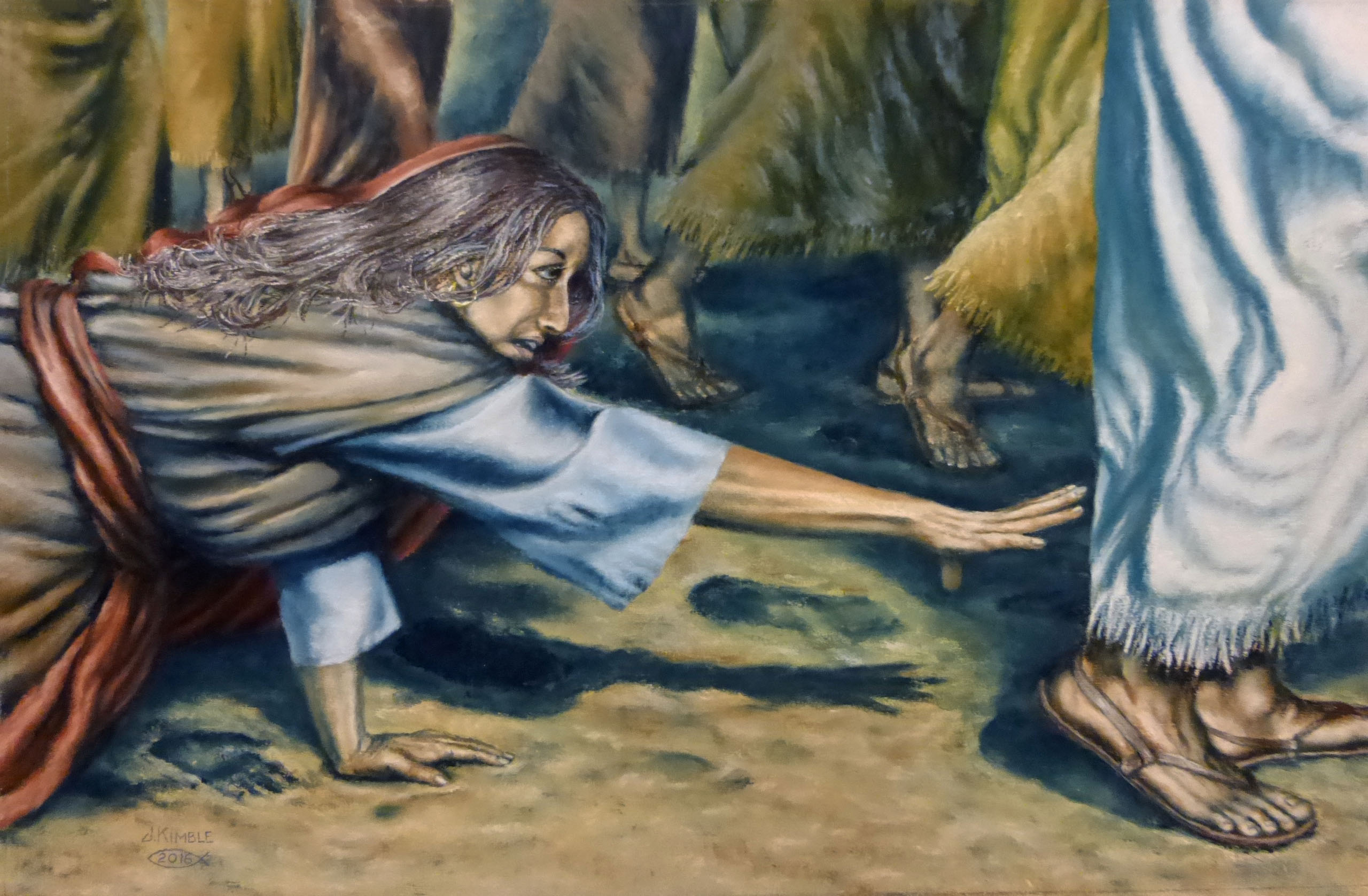
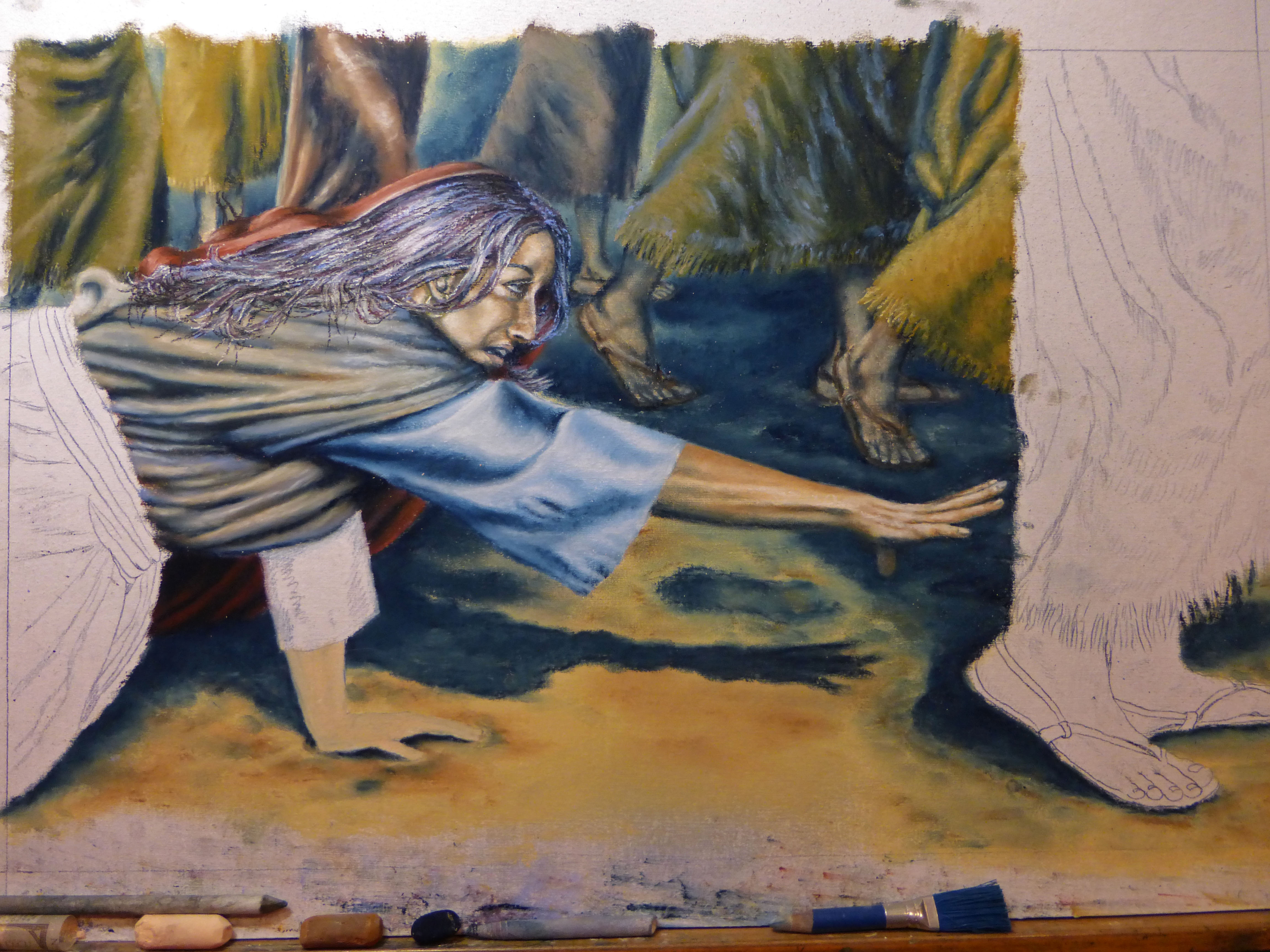
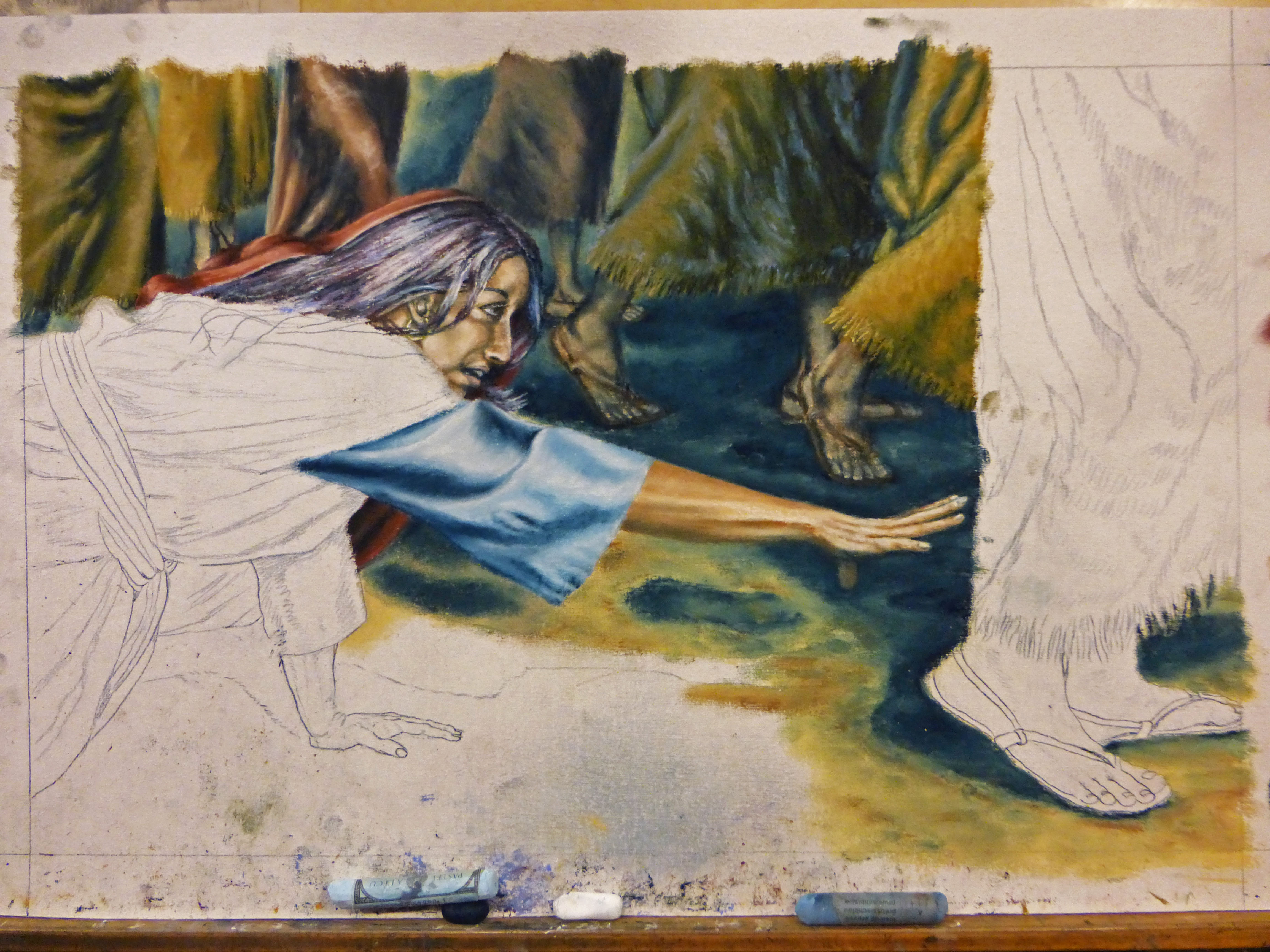
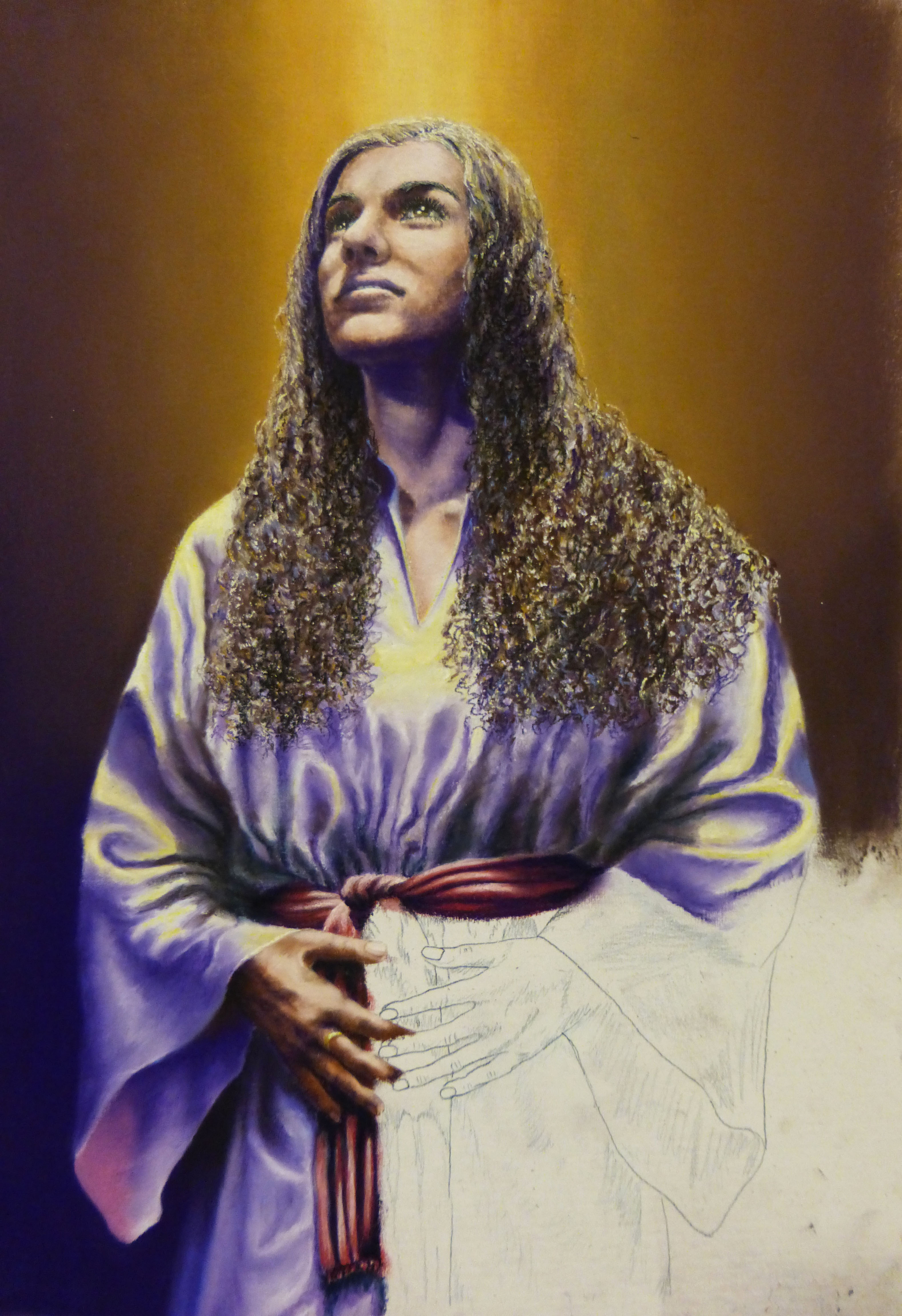
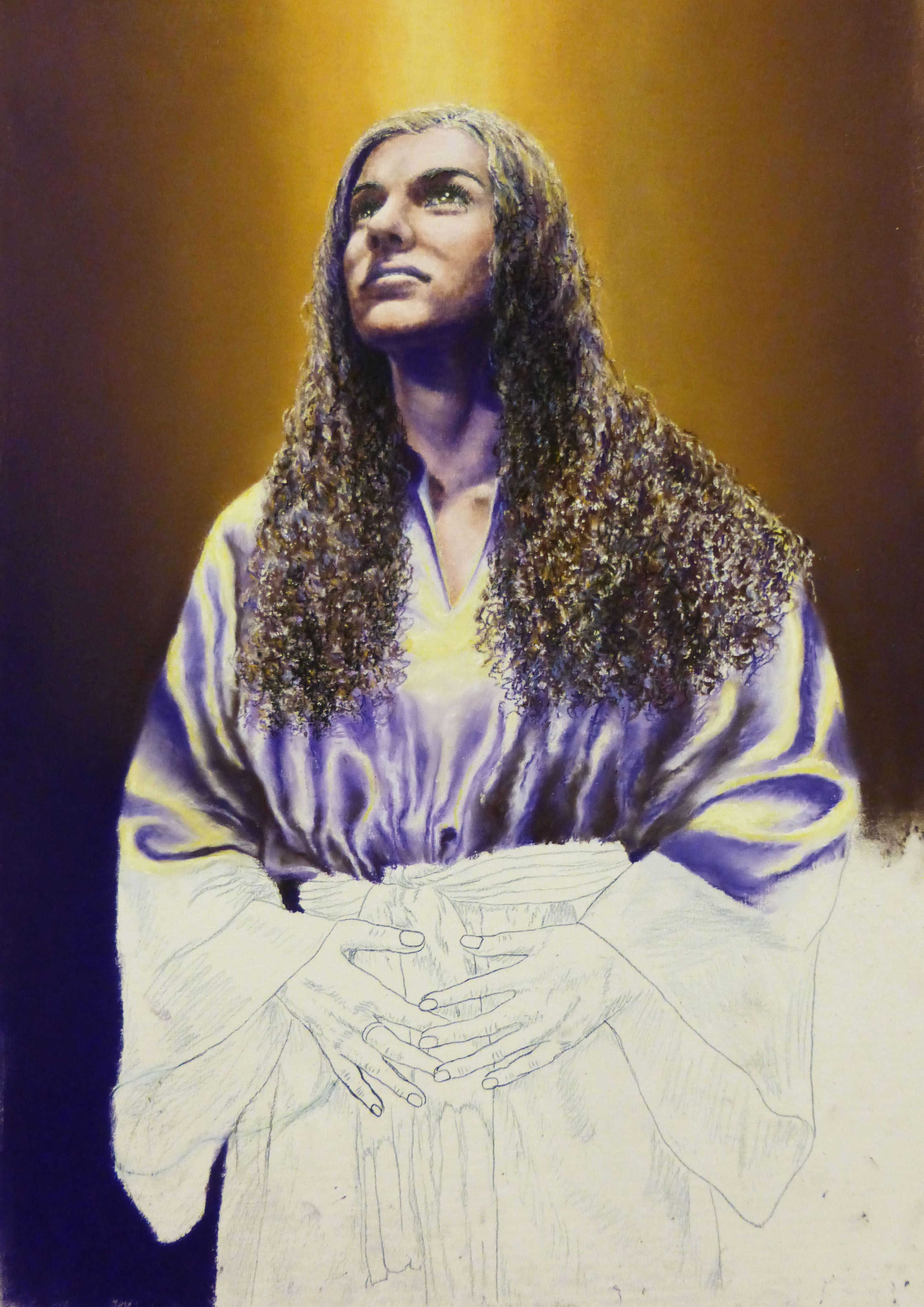
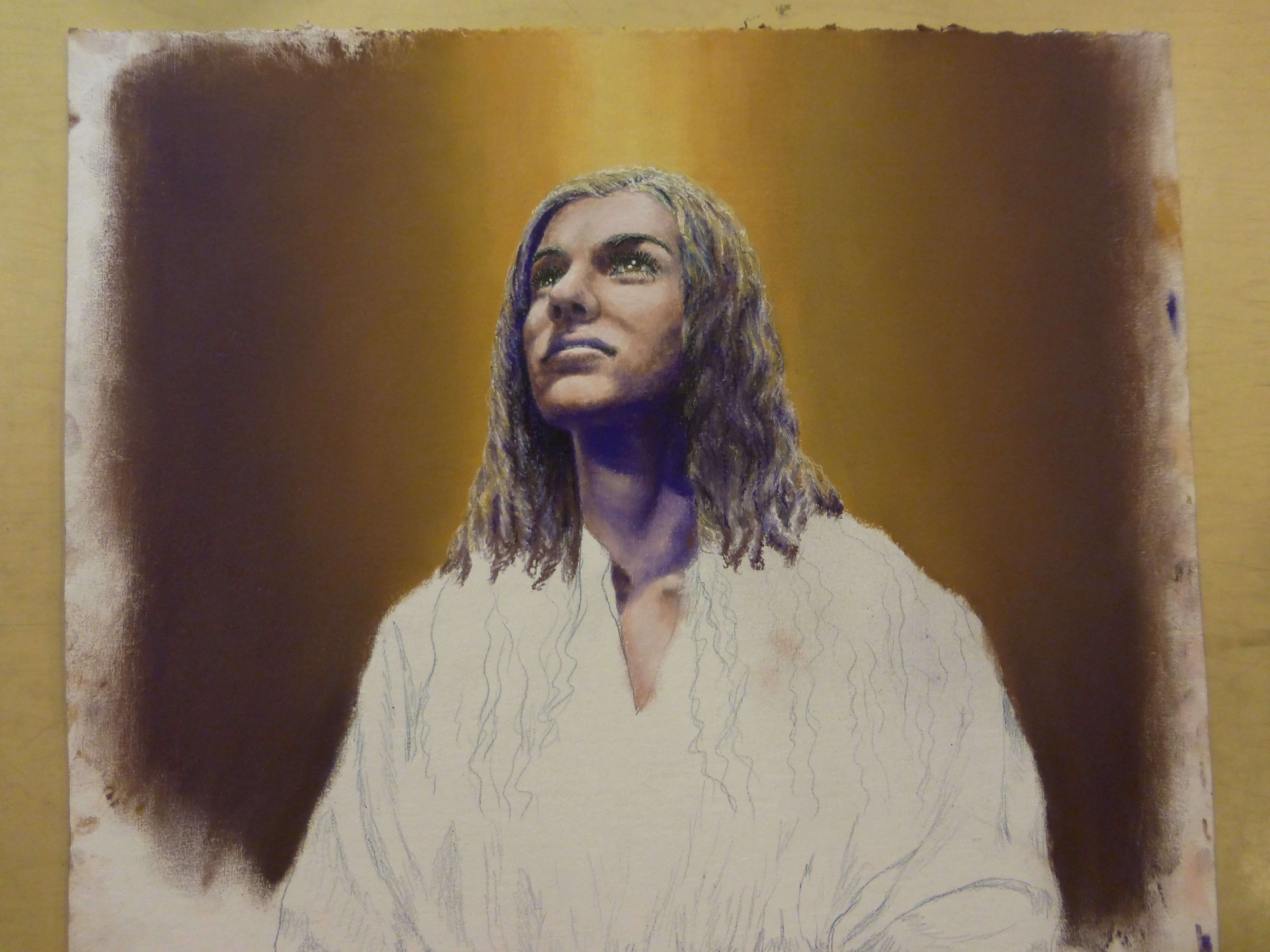
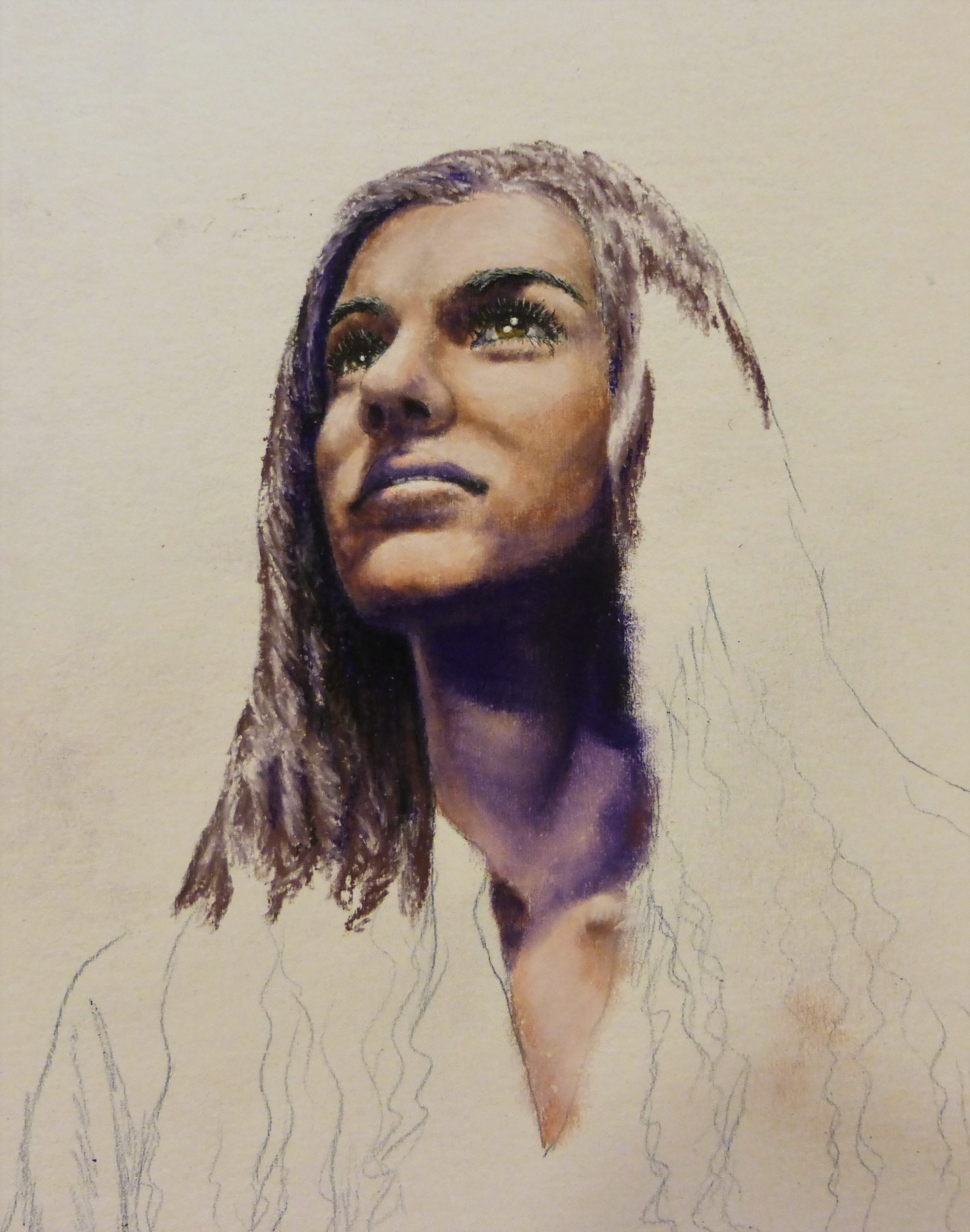
SHE’S FINISHED!
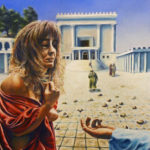
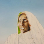
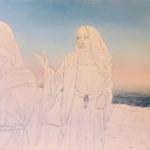
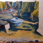
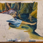
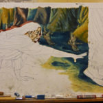
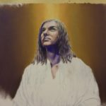
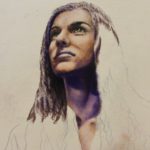
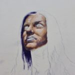
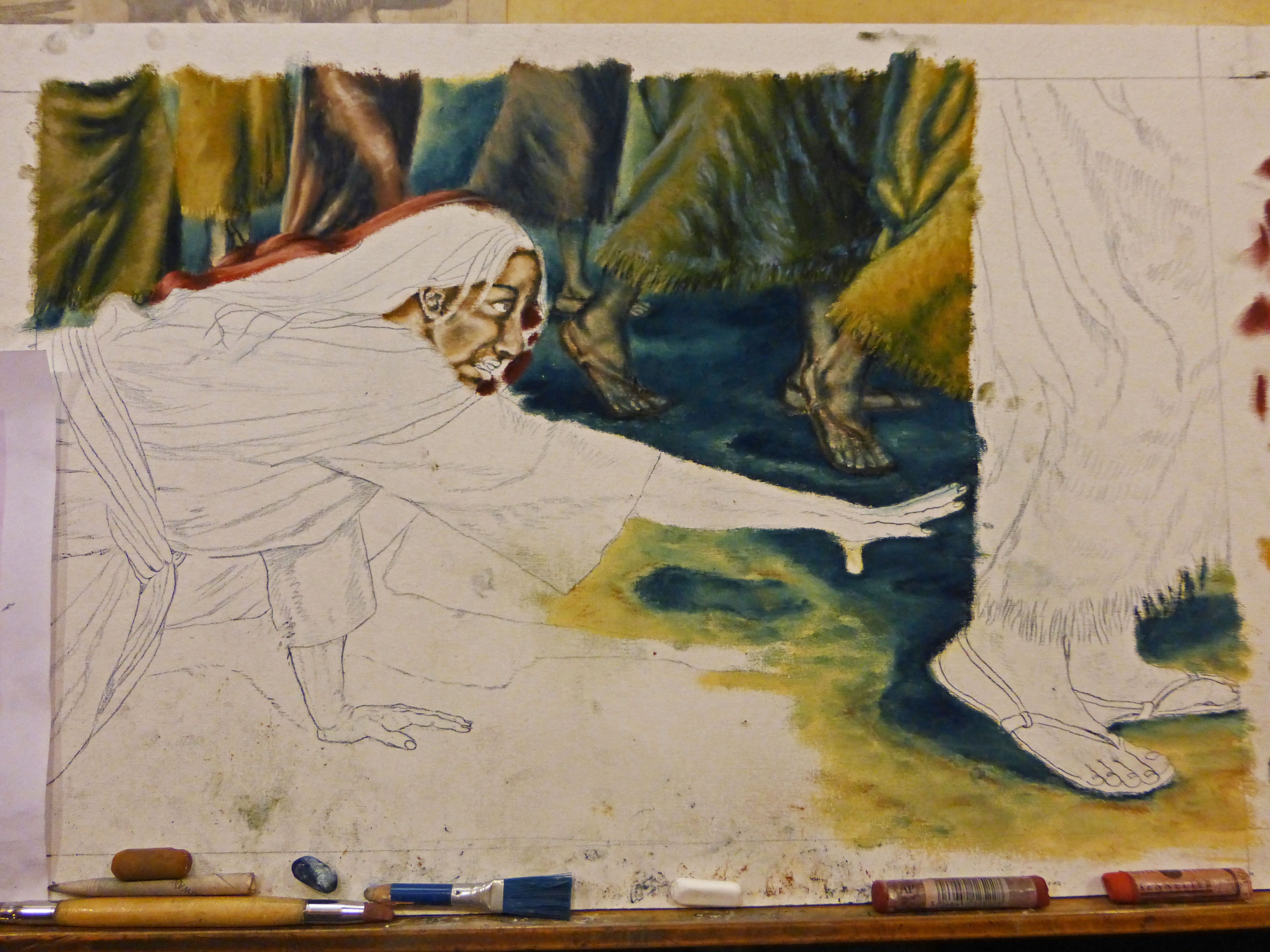
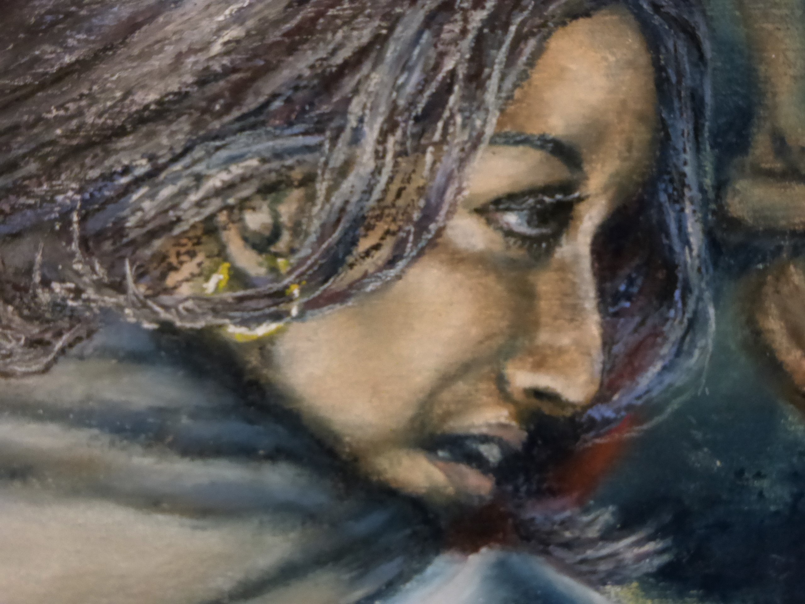
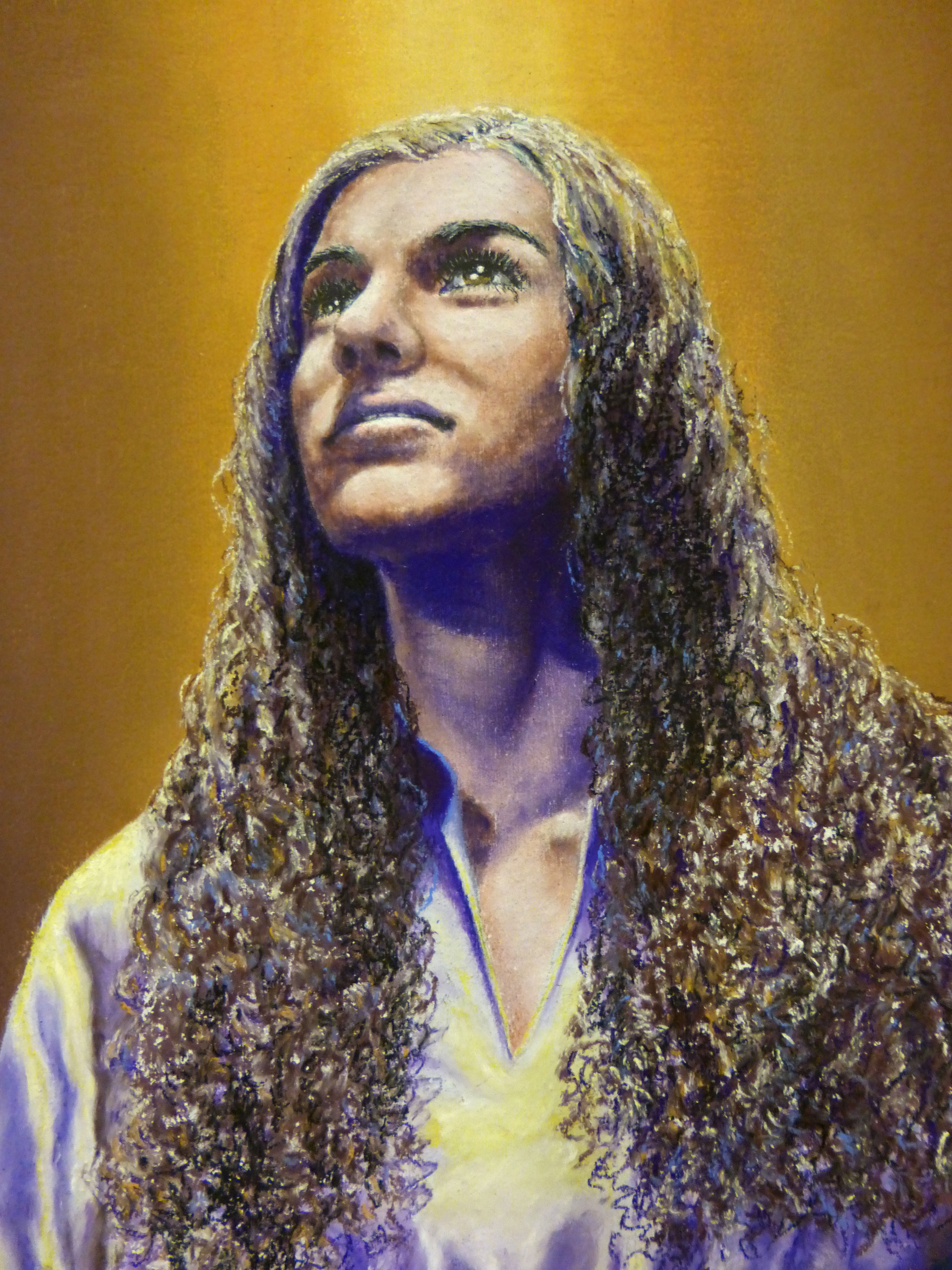
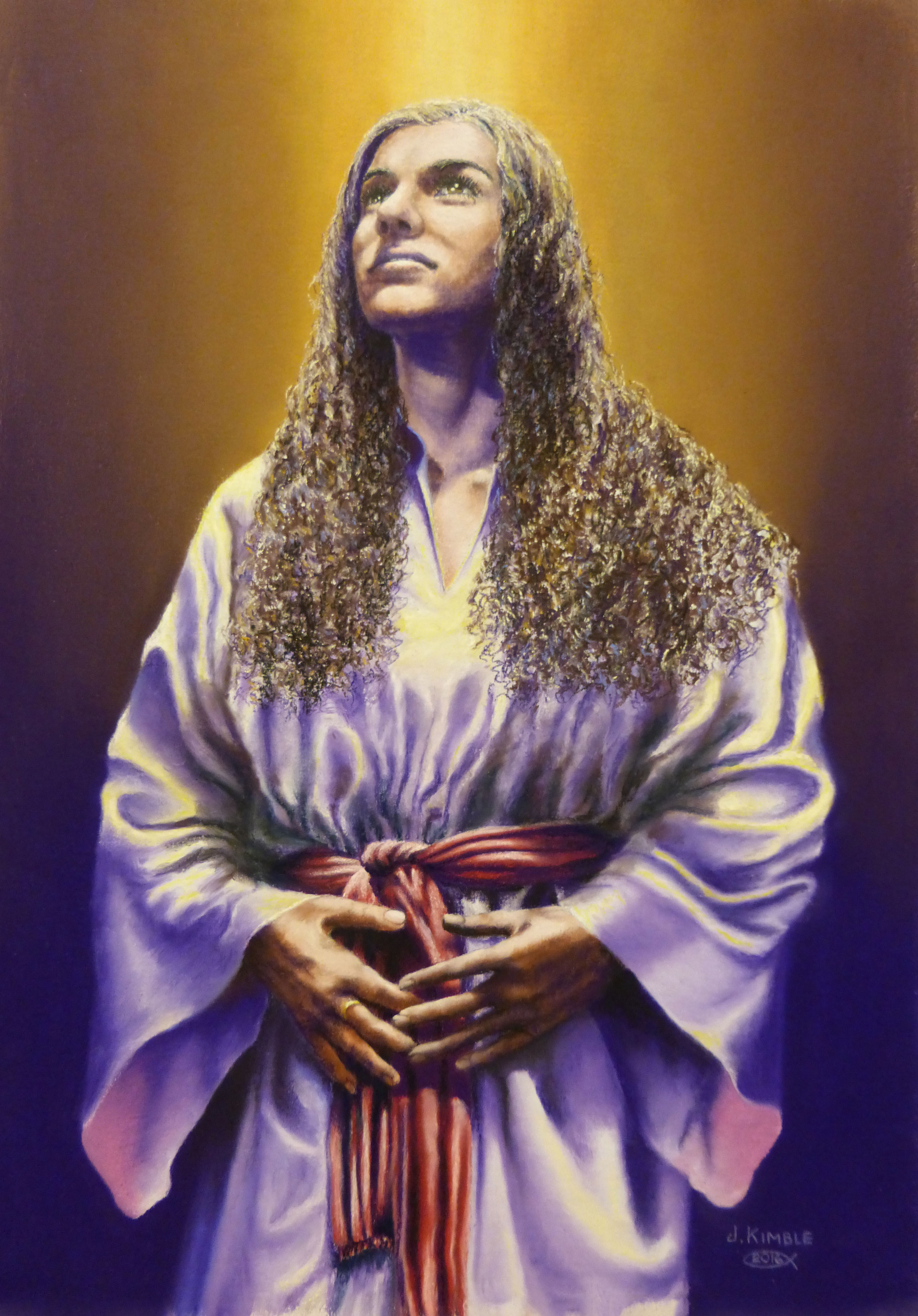
Over the last week I’ve been working on “THE WOMAN WITH AN ISSUE OF BLOOD.” She is finished now. I have a photo shoot lined up for Thursday, October 20th, to photograph the model for two of the last three remaining paintings. I’m really excited about that! Here are a few photos of the work in progress for this completed painting.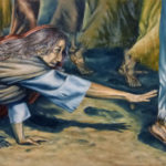

by jkimble | Oct 1, 2016 | Original Pastel Fine Art for Sale
A NEW PAINTING ON THE DRAFTING TABLE!
After a couple of days gathering my model photos and selecting the ones I want to use, I have finally begun work on my ninth painting in my series of twelve women in my “WOMEN’S STUDIES — Defining Moments”. I had to get three different photos to incorporate all the details I want for this painting of the “The Woman With An Issue Of Blood”. I didn’t get real far this evening, but it’s a start! I’m always glad to make a new start on a new piece of work!
by jkimble | Aug 16, 2016 | Original Pastel Fine Art for Sale
INSANELY FAST!
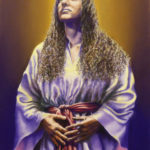
This is crazy! I started working on the pattern for “Mary, Mother Of Jesus” on August 12th, and I finished her just FOUR DAYS LATER, on August 16th! That’s a real record for this project! I had no major problems or obstacles that needed to be worked out, not even anything I want to fiddle with after the fact. Everything went quickly and smoothly. Wow! Would that they all could be so painless! With the completion of Mary, I am now two thirds of the way towards my goal of finishing all twelve paintings. I’m getting excited to get them finished. I have her calligraphy yet to do, but that shouldn’t take but a couple of days or so. I can’t get over how fast it went. I think Jesus just wouldn’t want me to mess up His Mamma! I thank Him for letting me paint her (as I envision her) so painlessly!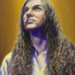
by jkimble | Aug 9, 2016 | Original Pastel Fine Art for Sale
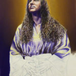
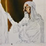
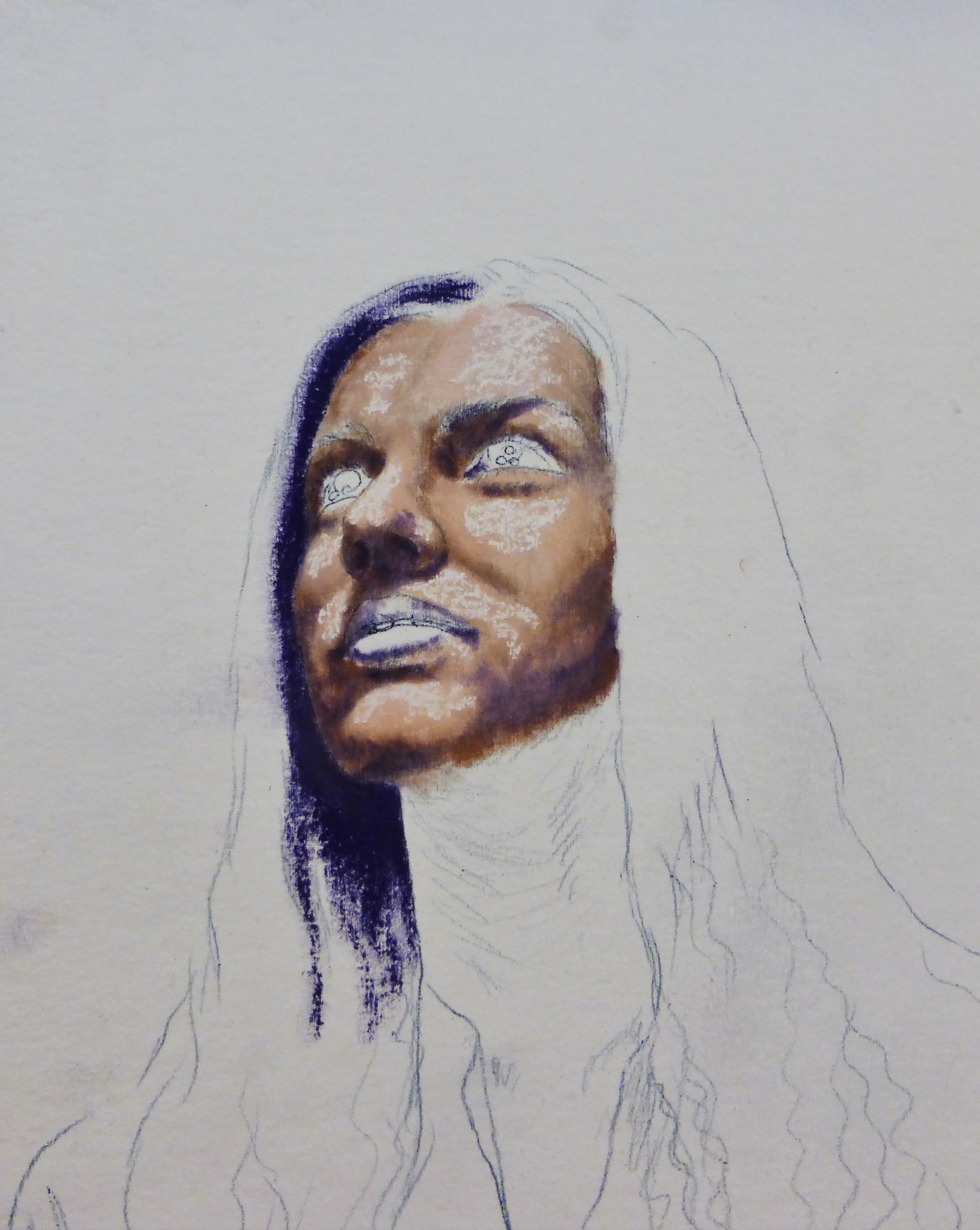
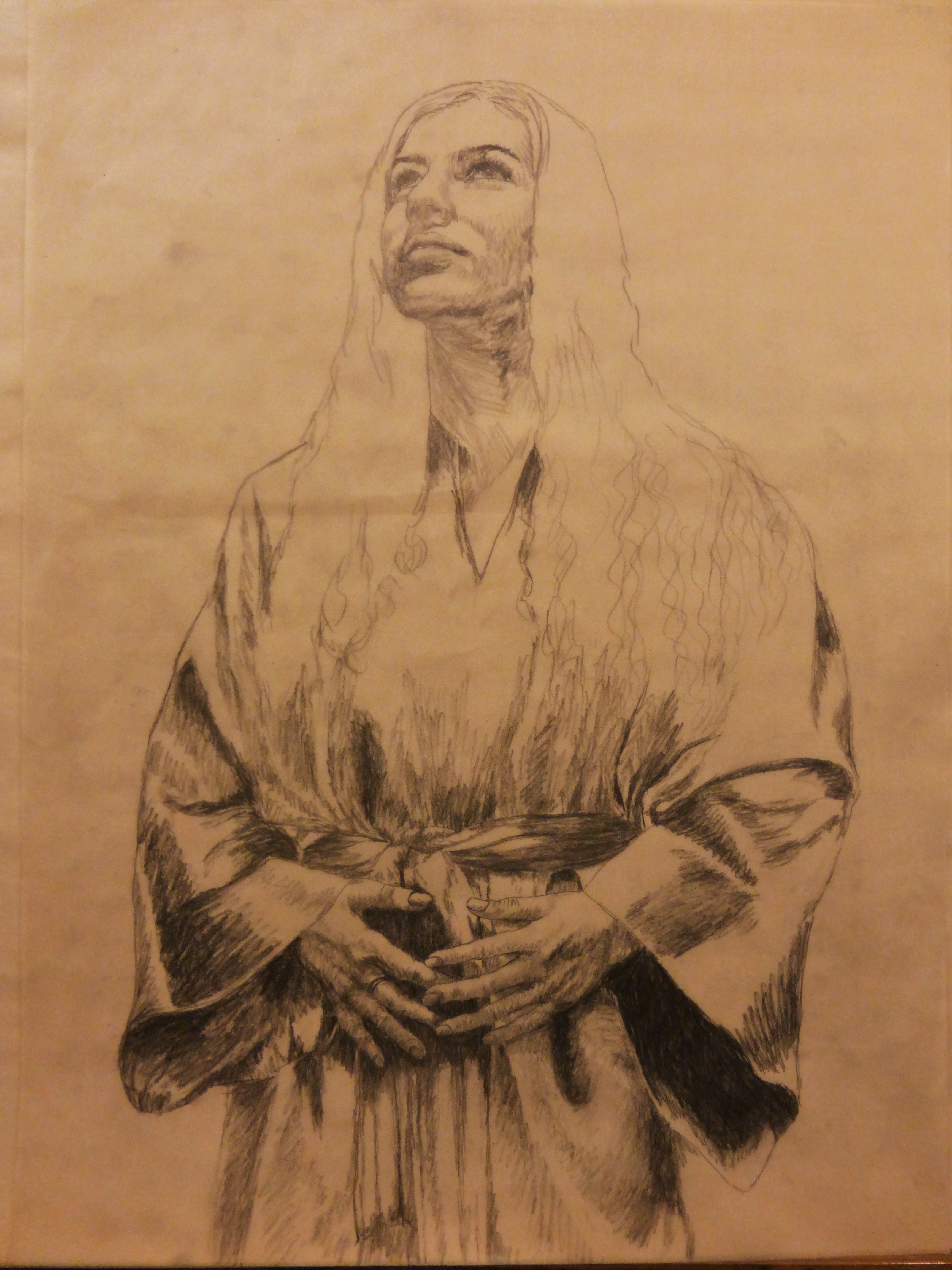
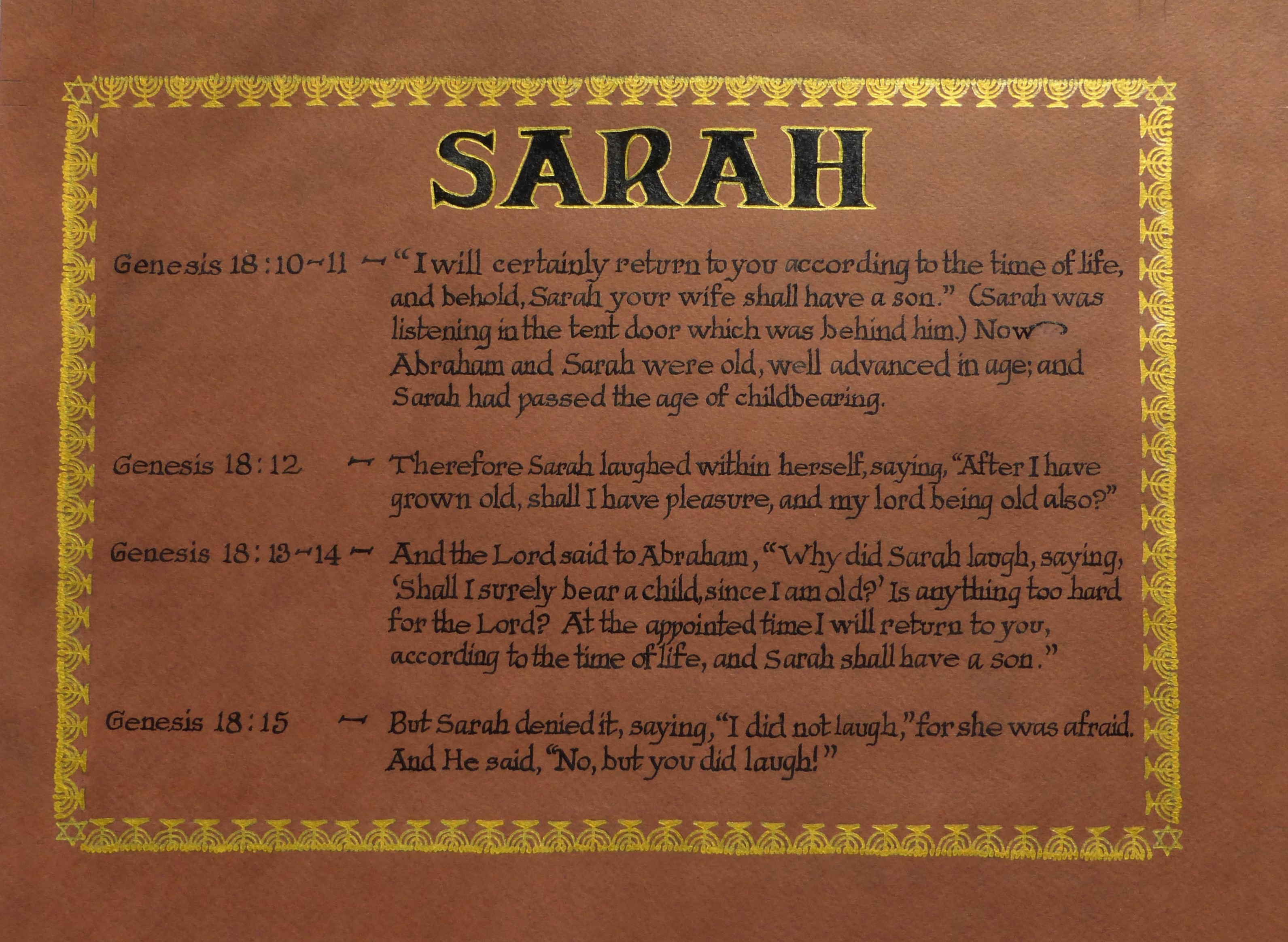
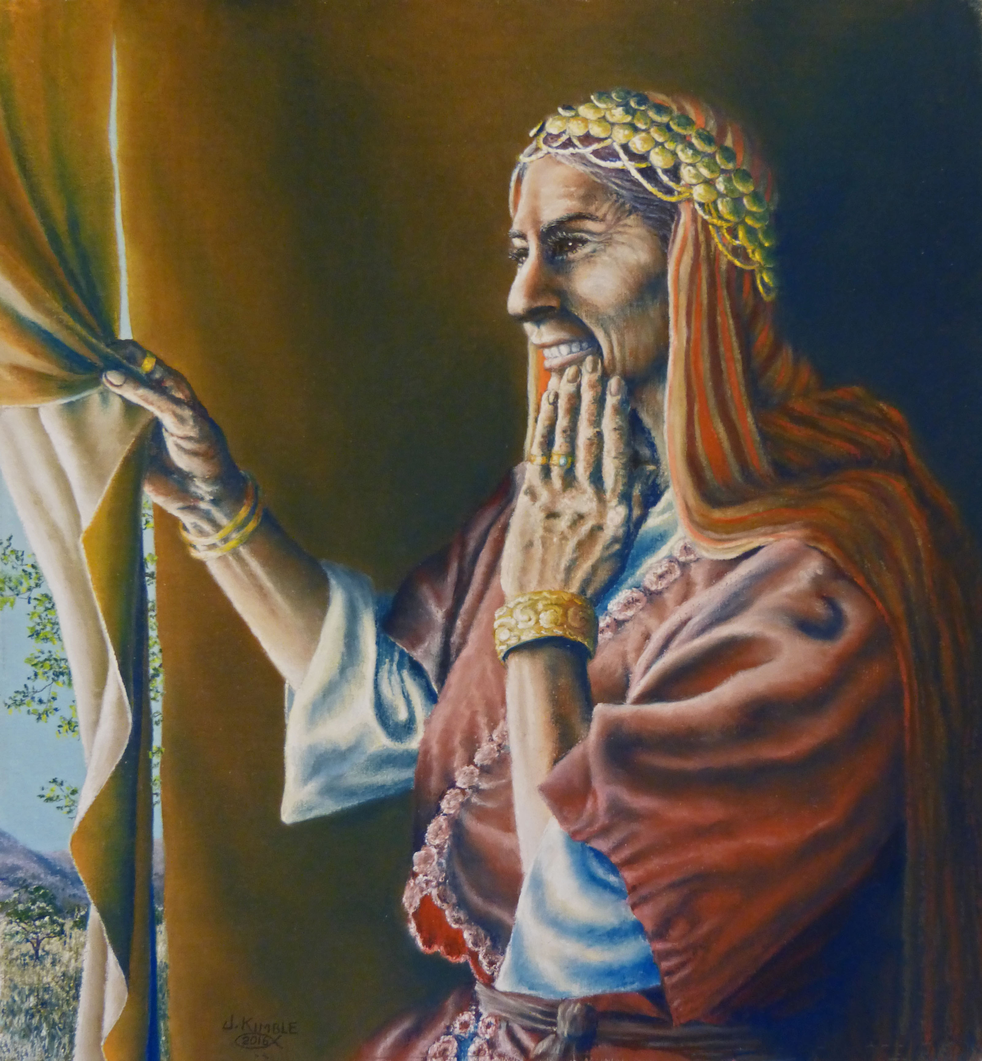
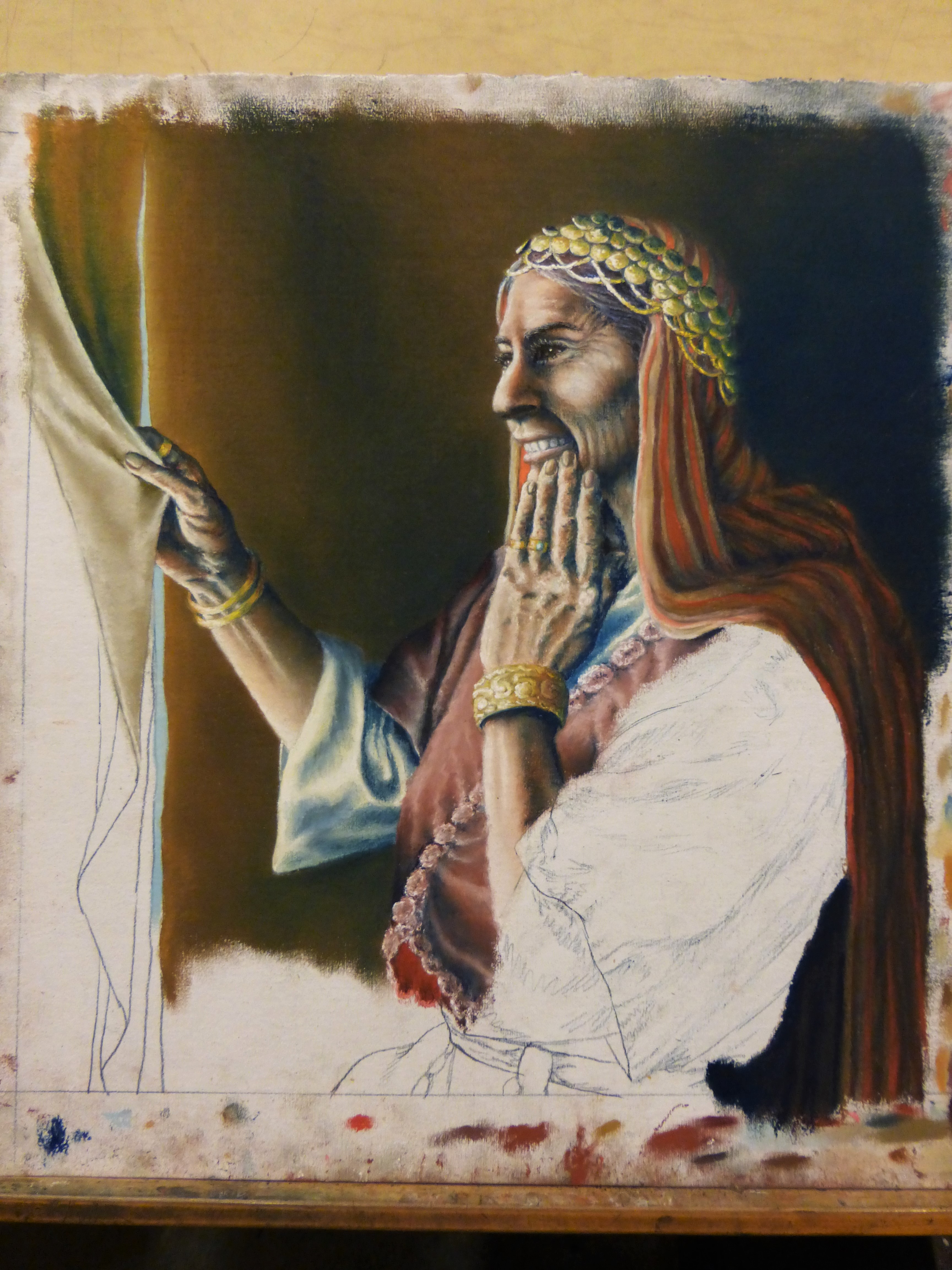
Oh my goodness! I’m thinking I got a new computer somewhere in between this post and my last one, which may account for no recent posts about the creation of “Sarah”. She went well. I started her in July and finished her yesterday, including all calligraphy. She, along with “The Woman Who Anointed Jesus”, both await framing. “Sarah” was challenging to do in many respects, but not something I thought would be awfully troublesome. The one thing that annoys me is the tent flap, which seems like a silly thing to give me trouble. I may fiddle with it some more. Meanwhile, here are a few pics of her progression.

by jkimble | Jul 11, 2016 | Original Pastel Fine Art for Sale
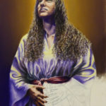
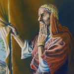
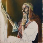
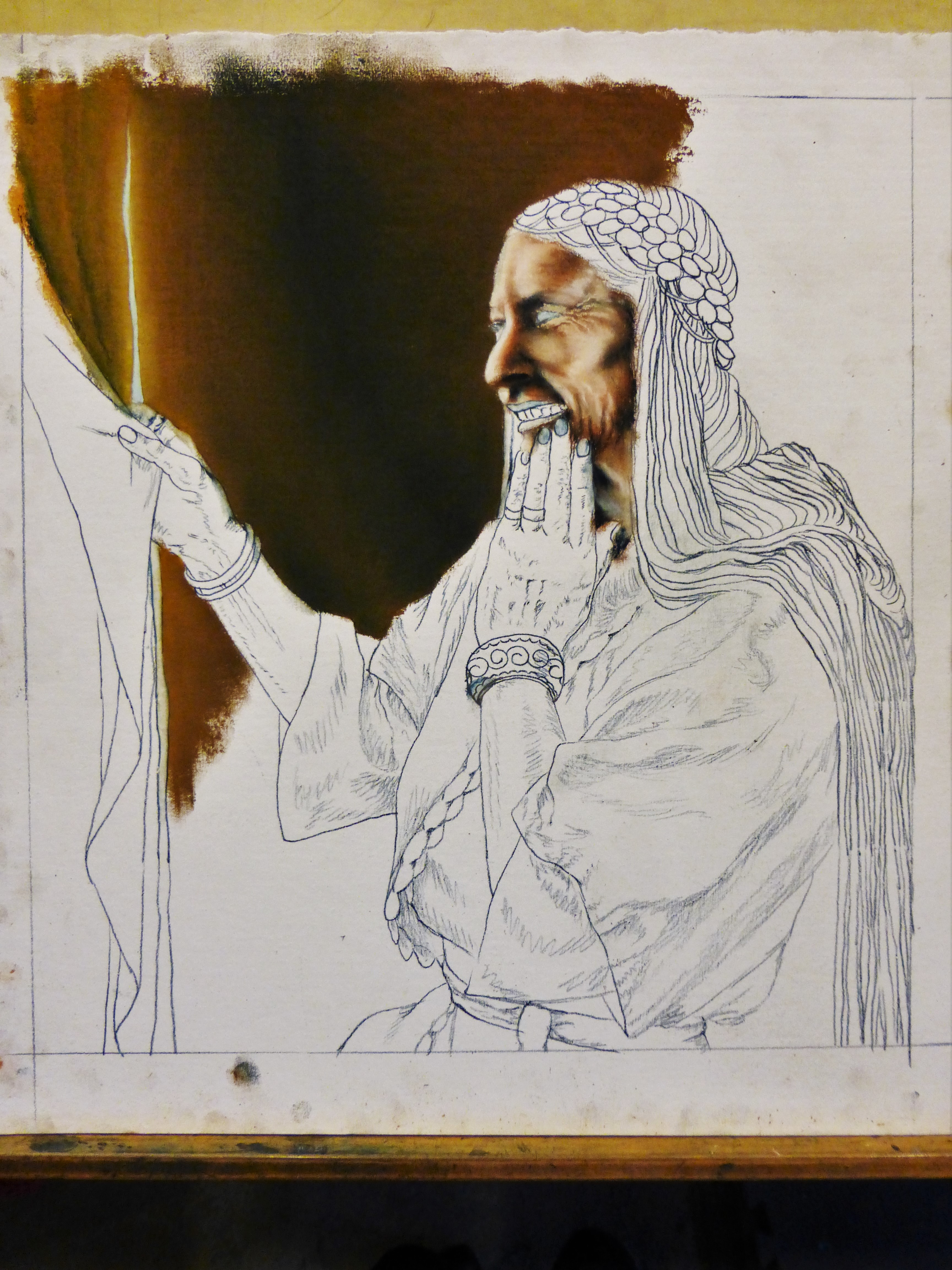
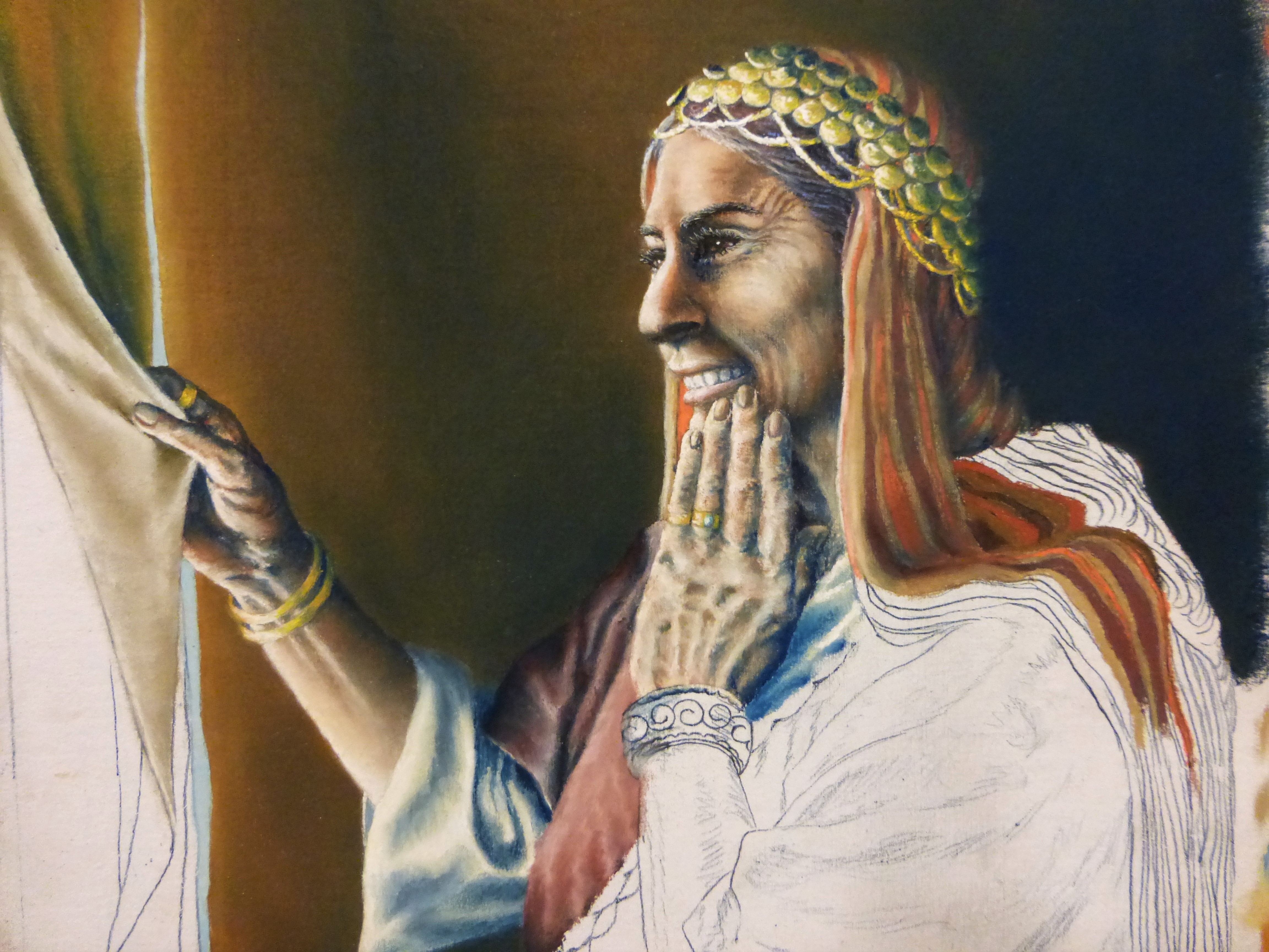
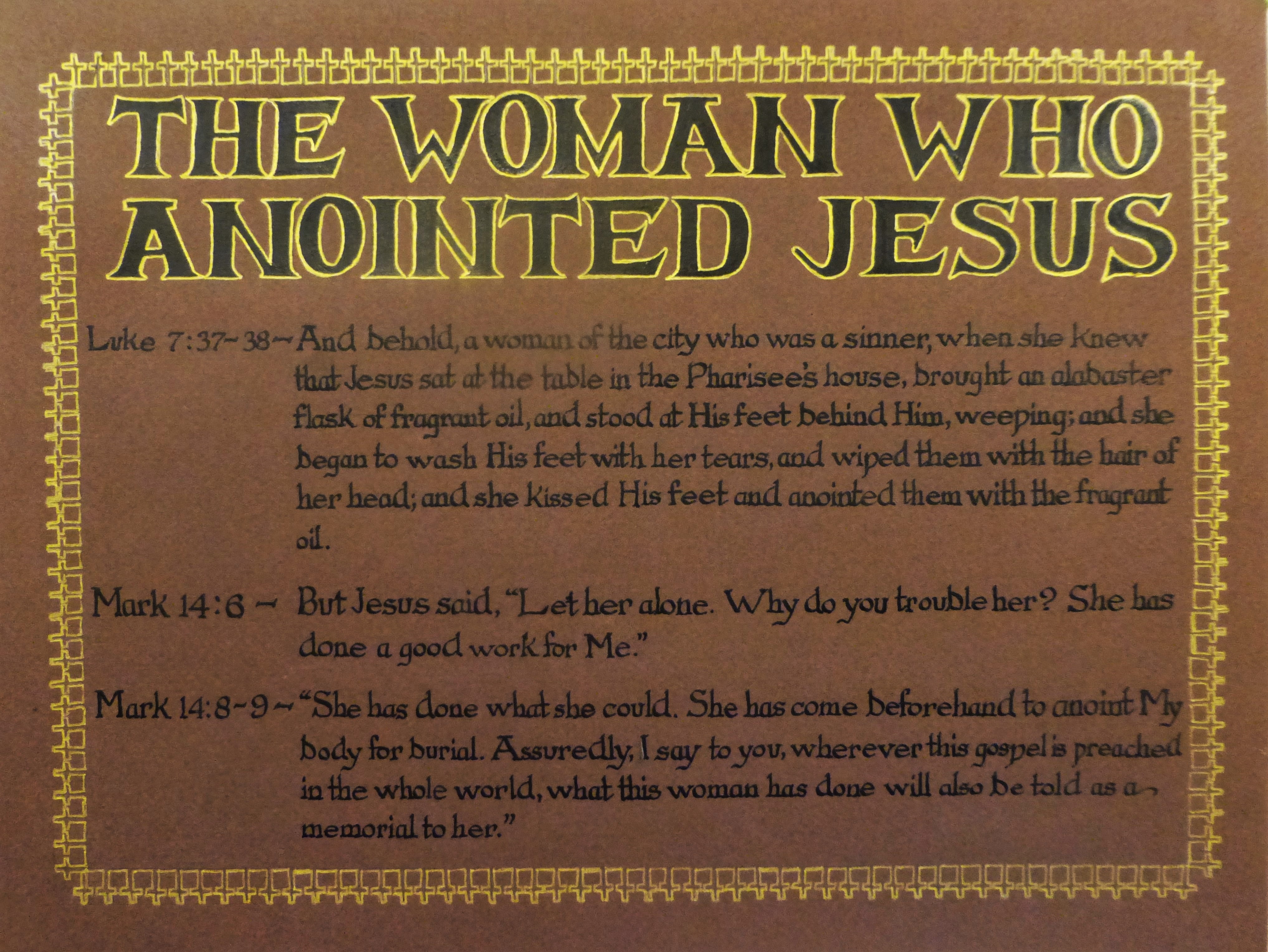
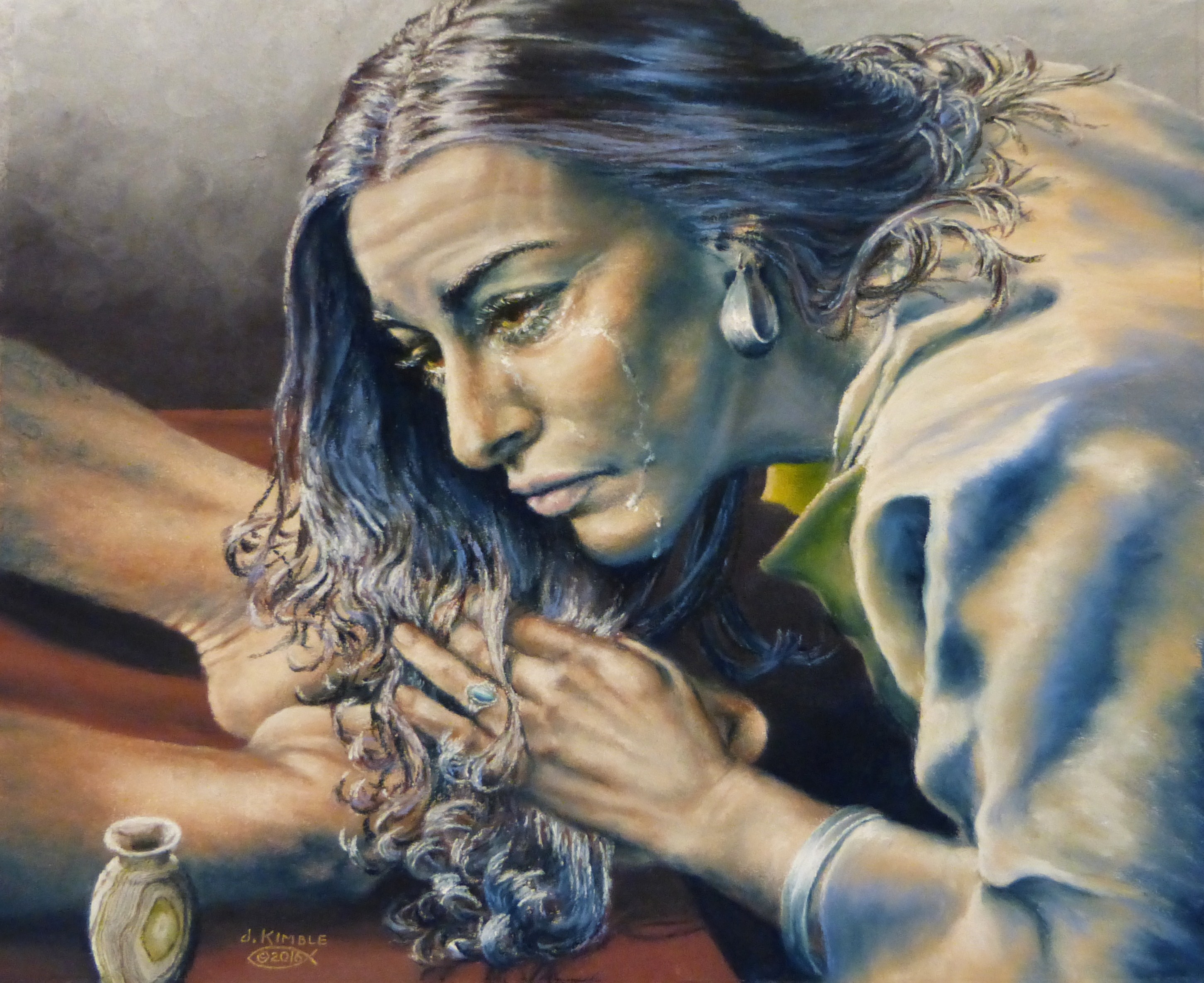
I tinkered around with “The Woman Who Anointed Jesus”, and corrected a few tiny little things that no one but me would ever notice, but she’s exactly the way I want her now. The hardest part of any of these paintings for me is the lettering of the scriptures which accompany each piece. I don’t enjoy lettering of any kind, but since this is a God-given project, I must do what He tells me to do! So, after a few days of deliberation about which scriptures from the four different accounts I would use, I selected verses from Luke and Mark. One night I did the title. The morning after that, I completed the body of the lettering. On the third day, I intended to outline the title only, but ended up designing and completing the border pattern as well. They are little crosses! Amazingly, everything went smoothly and I got it all done and cleaned up. So, #thewomanwhoanointedjesus awaits framing! Now, it’s on to preparing for “Sarah”…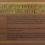

by jkimble | Jun 21, 2016 | Original Pastel Fine Art for Sale
I have tinkered around and fiddled with small details on this painting, and I believe she is finished. There comes a time on every painting when you just know that enough is enough, and you’ll only go downhill if you fool around with it any more. Every artist needs to know within his or her own being when a painting is finished! Therefore, “The Woman Who Anointed Jesus” is FINISHED! Now, I need to move on to the supporting scripture calligraphy for her.

Recent Comments