by jkimble | Mar 30, 2017 | Original Pastel Fine Art for Sale
NOOOO……… NOT COLORED CHALK!
A couple days ago a person from a local arts council where I maintain a membership was viewing my art prior to hanging some in their exhibition area. She made the observation that she never thought of pastels having such bold, vibrant colors. Alas, that is what so many people believe about pastels. What a mistaken impression! Another misconception is that pastels are merely colored chalks. That may be a matter of semantics, however, their manufacturing process is similar. So, let’s tackle the differences.
I’ll take the colored chalk issue first. What is chalk? To put it in simple terms, chalk is made from finely pulverized limestone (calcium carbonate), quarried from the earth. The powdered limestone is mixed with dry, powdered pigments if colored chalk is desired instead of white chalk. Water is added to make a slurry about the consistency of clay, then extruded into long, uniform “strings” about two feet each on sheets holding five strings. The sheets are placed in an oven where the strings bake at about 188 degrees F. After the chalk strings are cured, about four days, the strings are cut into the standard chalk lengths we all are familiar with, boxed, and shipped to customers. This medium is used widely in schools, and for sidewalk drawing. It wipes away and washes away easily. Colored chalks have a low volume of pigment material, which results in pale colors.
Now, what are pastels? In simple terms again, the chief ingredients for pastels are methylcellulous, a non-greasy binder, and pure, powdered pigments. The methylcellulous is just enough to make the pastel mixture adhere into sticks so that they can be picked up and stroked on a surface without crumbling uselessly. In addition, however, there may be added clay and oils. This mixture makes a slurry the consistency of tooth paste. Like chalk, it is also extruded onto sheets of about five strings. Pastels, however, must have a little moisture, so they are air-dried rather than cured in an oven. Because the binding content in pastels is so low compared to all other art media, such as paints, and certainly colored chalks and pencils, they produce the purest color saturation with a velvety texture unlike any other medium. Thus, their colors and effects are the most vibrant and vivid of all the art media out there. The small amount of oils and binder used in pastels produce buttery smooth consistency, and help the pigments adhere to the surfaces they are applied upon. They do not work well on slick surfaces, however, so a little “tooth” on the painting surface works well.
Because their pigments are so pure, pastels are very color-fast, however, they should be protected from prolonged exposure to UV light and moisture just like any other fine work of art. Pastels won’t turn yellow, crack, or darken over time, making them the most durable of all art media if properly protected. With proper protection, pastels can last for decades and centuries. Some surviving pastel paintings and drawings from the 16th and 17th centuries have survived just as fresh and beautiful today as they were when they were created. See my blog post, “What About That Glass?” for the UV protection advantages of museum quality glass for framing pastels.
by jkimble | Mar 23, 2017 | Original Pastel Fine Art for Sale
THE WHAT, HOW, AND WHY OF GICLEE PRINTS
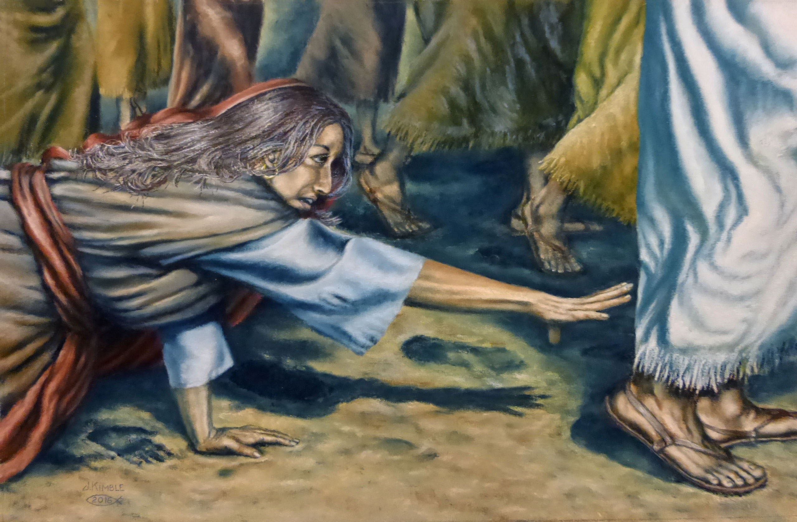
Yesterday, My Man Jim and I drove down to my hometown of Kilmarnock, Va to pick up work from my framer, and leave with her the last two paintings to be framed. We also took the new pieces to the company which has been shooting the digital images for my reproductions of Women’s Studies. I have a customer who needs a print of “The Woman With An Issue Of Blood.” We needed to talk about several issues concerning this. It was a great shoot for the new work, and a great conversation about the giclee print.
Giclee? What the heck is that? Well, it surely isn’t an off-set lithograph print, which used to be the standard for all art prints mass produced up until the 1990s. It is a somewhat generic term used to describe a print made by an ink jet printing machine.
This is how it works in the simplest of terms. The imagery for giclee printing is shot with a digitized camera, where color adjustments and flaws can be adjusted or removed through a computer screen. The term “giclee” came from a French term which means to spray, squirt or otherwise force liquid onto something, and that is precisely how these prints are made. This printing method was developed in the 1990s with the invention of a state-of-the-art commercial ink jet printer equipped with thousands of tiny nozzles that spray the ink onto the paper or canvas. This allows the tiniest details and intricacies of color to be reproduced truer to the original than any litho process could hope to achieve. As stated earlier, it also allows you to print your work on canvas as well as paper. Canvas, stretched over a frame as an original oil painting would be, looks just like an original. Paper prints require glass for protection from dirt and other accidents, such as exposure to moisture or water, but canvas prints do not.
I can’t conceive of any reason why I would ever again use off-set lithography to produce a print. There are many draw backs to the off-set litho method of printing. First, the prep work and machinery used to print lithos requires one to print a god-awful amount of prints at one time to be economically feasible. Hundreds, or even thousands of them. Storage space for all these prints can become a real issue. Second, all of the costs are up front, and that can break your bank account! It can cost several thousand dollars for a single print edition, and make take years, if at all, to get your money back in sales. Third, they fade. Litho inks are dye based. They are not color-fast when exposed to sunlight or any other light source producing UV rays, such as fluorescent lighting. Everyone has seen the prints in businesses or opposite glass-lined walls that have “gone blue.” The reason? The yellow and red dyes have faded out from over exposure to UV light rays, leaving only the blue, which has a longer wave length. Giclee printing, on the other uses pigment based inks which do not fade. Although giclee prints haven’t been around long enough to stand the test of time, lab testing has proven them to be light fast up 100 years or more. I’ll take that any day! I’ve had too many customers cry for replacements when they hang an expensive lithograph print right in front of their windows. Nowadays, with the energy efficient fluorescent light bulbs becoming the norm in every household, even dark corners of a room are no long safe. One of the best reasons to use the giclee printing process is the ability to print on demand. You don’t have to print (and pay for) the whole edition up front. There are no metal printing plates to break down because everything is digitized and stored on a computer, CD or DVD. If you need one print, you can order one print. If you need five, or ten or 50, you can order those amounts and pay for those amounts. Fourth, As stated earlier, this process also allows you to print your work on canvas as well as paper. Canvas, stretched over a frame as an original oil painting would be, looks just like an original. Paper prints require glass for protection from dirt and other accidents, such as exposure to moisture or water, but canvas prints do not. Technology has indeed made the fine art print business fast and economical for just about anybody!
A few words of caution: Research your giclee printer. Make sure they use archival inks and papers. There are many online giclee painters out there who may offer the cheapest prices, but will also give you the cheapest quality of prints. If you want an excellent, long-lasting product, you can get that from a reputable printer who may charge a little more, but will still be very affordable.
by jkimble | Mar 16, 2017 | Original Pastel Fine Art for Sale
THE ART OF MAKING ART IN A BOOK
Yes, that’s what I’m engaged in right now. Who thought putting a book together was an art? I never gave it much thought before. Until I had to do it myself! There is so much to writing I never knew! Ever since I was in high school and college, people, including teachers, always said I was a good writer. Friends and family members told me I should write a book. I read prodigiously when I was in school, which prompted the desire early in my life to do just that. I never knew what I wanted to write about, and the idea got shoved to the back burner as painting took precedence. Throughout the years, I gave thought to the book idea occasionally, but it never went anywhere except back into my memory bank, stored in the “Some Day” file. If you have read my page called “About My Book And Its Art” on this site, you already know how I’ve come to be writing a book, my first. Of course, there is a series of my paintings showcased in the book, but they aren’t merely paintings. They depict 12 women from the Bible, and the life lessons they can teach each of us through their stories. So, first I had to paint the paintings. That took me almost three years. In between paintings, I wrote about each woman. I wrote like crazy, anything and everything that came to my mind about them. There. I was finished! I thought I’d done a pretty good job!
I had no idea the hard part was about to begin! A dear friend who had some writing background offered to look at my manuscript. She was my first experience with “editing.” When I got it back, it was COVERED with red ink! Run-on sentences, punctuation errors, and poor word choices where her major complaints. But she loved my poetry and noted the positive things also. It was nice to know that not all the red ink was bad! Then, my son, who has a college degree in English with an emphasis on writing and editing, offered to edit the book for me, I gladly took him up on his offer. He CRUSHED me! I hadn’t had such a blow to my artistic ego since art critiques from The Pastel Society Of America many years ago! It was like having a baby you loved dearly, and someone telling you that it was the ugliest baby they’d ever seen, and you should try again! It took me a few weeks to get over my hurt feelings and really delve into the sense of his advice. I went into another writing frenzy, trying to incorporate the suggestions John had given me. I lost count of how many times I rewrote the whole thing. At least four or five. I began to have terrible misgivings. I cried. In tears, I said to John that maybe I wasn’t such a good writer after all, and had nothing to say that anyone would want to read. That’s when my son said these precious words, “Mom, EVERY writer says that at some point!. Get up and keep going!” Learning to accept editing advice in writing is just as important as critiques in art work. If anyone truly wants to improve his or her work, this is a must! .
I began to listen to webinars from noted authors. They offered tips, techniques and writing apps to help aspiring writers improve their skills. I read books on the subject of writing. I read many other books with an eye to discerning which writers held my interest, which didn’t, and why. I got a Hemingway app for my computer to edit my manuscript with. It was amazing how much better my manuscript read after going through that process. John is continuing his deep editing, which covers things like redundancy, sticking to the theme, unnecessary filler, and so much more. I had to define my target audience, and write on a level I’m not used to for easier reading. I Googled my book title and found there were millions of “Defining Moments” titles already out there, ranging from history, science, and sports to every art form. This means I will re-title my book.
Finally, I can paint beautiful paintings, create unique and imaginative poetry, write interesting prose, but it I don’t put it all together well, it is a lost cause. I exhort my fellow artists and writers out there to do your homework if you are thinking of putting together a book. If you want to write a book about your art, I advise these simple things to think about first: paint and write what you are passionate about. Target your audience, write to that audience, and write it well! If you cannot afford to pay an editor, at least download a writing app (several are free). This will catch many structural and grammatical mistakes and improve readability. Then, transfer it to your MS Word or Office Word and take it through spellcheck. If you are self-publishing, check the customer reviews of the publishing houses you are considering. Call and talk to their representatives. Compare their publishing packages, because they all offer different services in varying packages, depending on the price point you’re aiming for. Yes, there is an art to this thing! If you don’t do it well, it’s bad art!
by jkimble | Mar 13, 2017 | Original Pastel Fine Art for Sale
THE LAST OF THE “WOMEN’S STUDIES” ART AND EDITING THE MANUSCRIPT
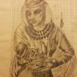


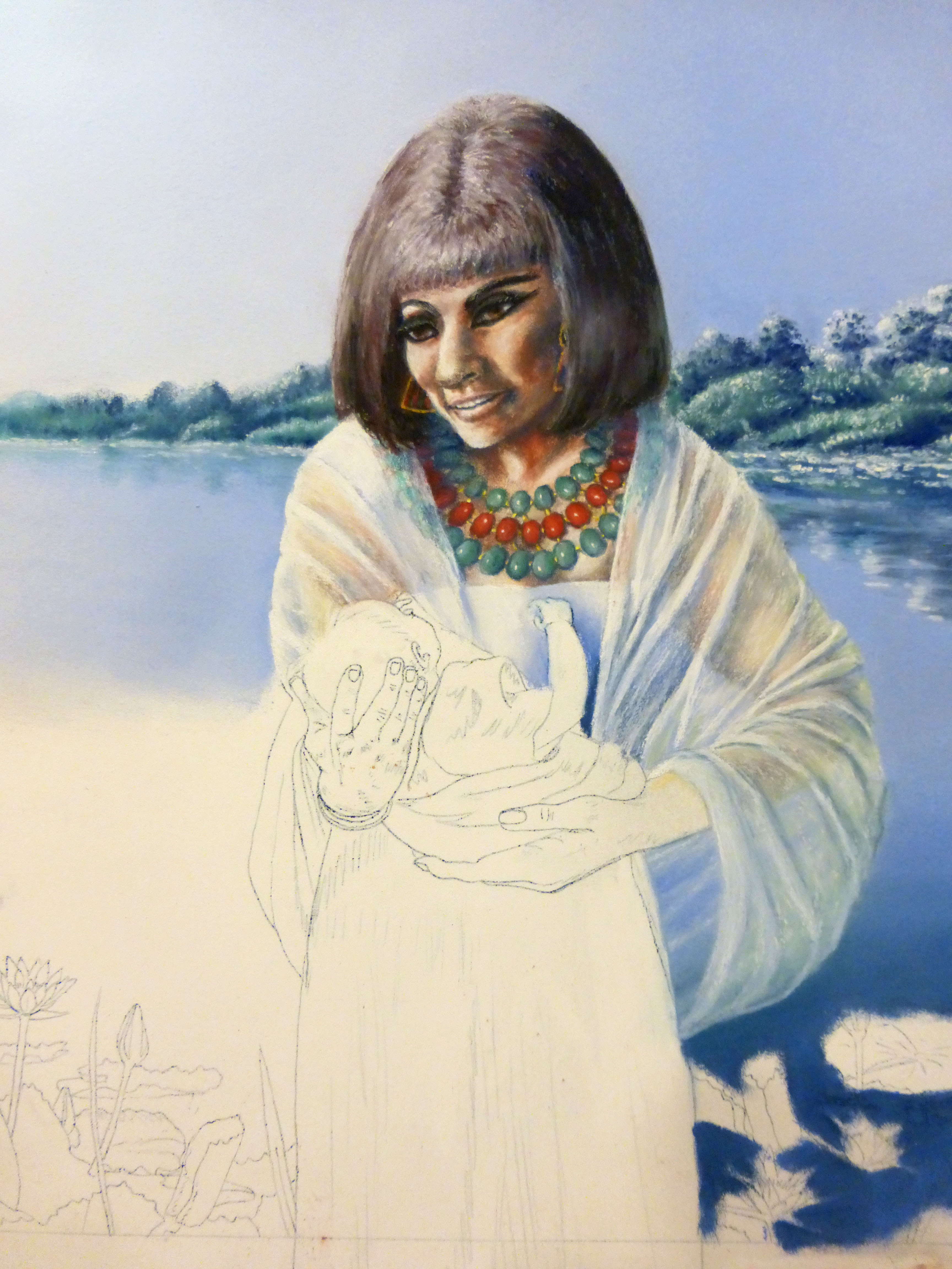
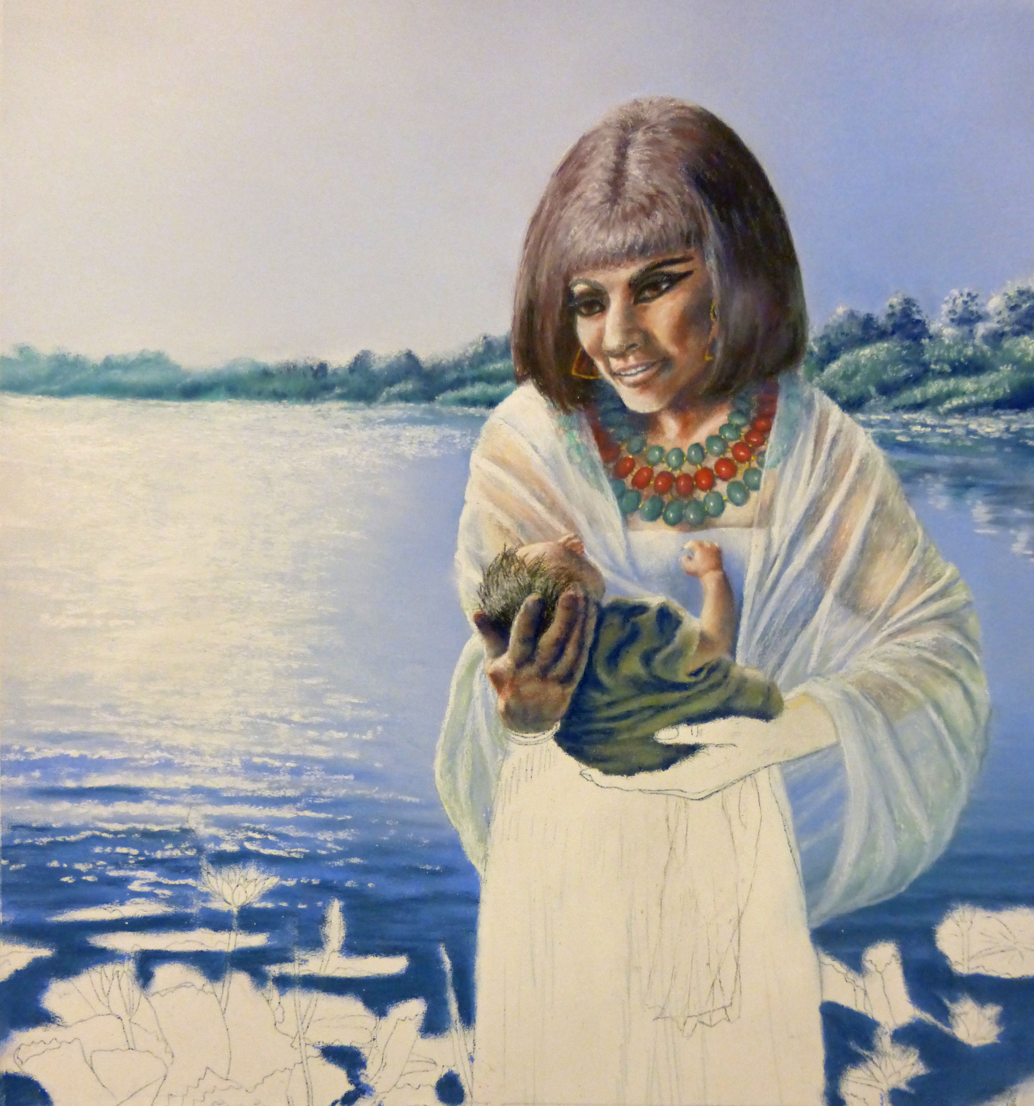
Well, it’s done. Last week I completed th e last of my paintings for “Women’s Studies”, number 12. She is “Pharaoh’s Daughter.” I had a few little issues with painting her, but overall, it wasn’t bad. Doing the calligraphy for her was amazing. I lined it all out, inked in the title, filled in the text, and completed the border, all without making a single mistake. That was truly a first for me, and also a miracle! Now I must move on to rewriting my manuscript and getting that ready for the final editing. This is not my favorite cup of tea! It is, however, something that must be done if I am to have a good quality, well-written book. So, onward!
With that in mind, I want to say a few words to aspiring writers out there. First of all, I read many, many books. Some are good, some bad. The writing makes the difference in many cases! A well written book will hold my interest, but a poorly written one quickly becomes boring. I can’t make myself finish reading a boring book. One that may have interesting subject matter, but is written so “scholarly” also becomes a dusty old tome on the shelf rather than a valuable addition to my library.
It was not until I got to the editing process of my manuscript that I began to realize so many mistakes new writers make, because I was making those same mistakes! After listening to some webinars from noted authors, I took their advice. I downloaded an editing app on my computer. The one I’m using is called “Hemingway” and is a free download, or you can pay a minor fee to purchase it and get free upgrades to the app as new versions come out. I paid the price for future upgrades. This thing has proved invaluable in improving the flow of my writing, its readability, and sentence structure. I had no idea it could make such a difference! There are other editing apps out there, too.
Now, it won’t tell you when you’re going off the main subject on tangents. It won’t correct redundancy or spelling errors. And it certainly won’t cut out unnecessary words, phrases, or sentences. You will need human eyeballs for those! (I transferred my manuscript back to MS Office Word for spellcheck.) But an editing app will help save your editor much time correcting mistakes you could’ve done yourself. Human editing is costly. It is priced out by the word count in the manuscript. Who wants to pay for words an editor will cut out? These apps will force you to rewrite in a more concise manner, lowering your word count. Any words eliminated before an editor sees it will lower your bill and make their job much easier and faster. Who doesn’t want that?
On top of all that, it will make you become much more aware of common mistakes and avoid them in your future writing!
Some words of caution: Don’t get so carried away by an app ruled by algorithms that you lose your writing style and personality. It’s OK to ignore a few things the app will tell you to change. Use common sense. Read up on your app to see what it does and doesn’t do, and break the “rules” where you feel it is necessary to retain the integrity of your work.

Recent Comments